714: Get the Bigger Pizza
23 Oct 2026And don’t bet against the smartphone.
Episode Description:
- Pre-show:
- 🗣️ ATP Holiday Store is here! 🗣️
- Follow-up:
- HomeView
- When was the HomeView hardware created?
- Is it expensive? (via Paul Heering)
- Amazon Echo Show 5: $99
- Amazon Echo Show 8: $199
- Amazon Echo Show 11: $249
- Amazon Echo Show 15: $349
- Wall-mount & regular HomeView pricing
- Is it to prevent cheapskates? (via mvk)
- Is it to prevent add-on dinguses (via Ben O’Matic)
- Knock-offs coming soon?
- Turns out, Jimmy is that guy. 😏
- Phone screen vs. Duo screen
- Will Marco be adding CarPlay support? (via Rick Allen)
- Apple TV
- Price history
- March, 2015: Apple lowers the price from $99 → $69 (timestamp link to 10m14s)
- Glenn Fleishman’s chart
- Microphones and HomePods
- AV1 (via Michael Barnes et al)
- What is “audio passthrough” (via Andrew Haglund)
- Price history
- The iPhone Duo has a replaceable cover layer
- HomeView
- iPhone Duo Creator Showcase
- iPhone Duo preorder experience
- iPhone Duo reviews
- MKBHD
- HTX Studio
- Tim Pan
- Joanna Stern
- Nilay Patel & Allison Johnson
- Gruber
- John also brought up Computer Chronicles
- Apple “Pro and Tell” event next week
- Post-show: Marco has something to share
- ATP Diamond Dogs: Talk Me Out of It II
- The thing Marco shared
- 🚨 You will want to click this after Marco introduces it, but before John talks about his experience! 🚨
- Members-only ATP Overtime: The people holding up the internet

Sponsored by:
Become a member for ATP Overtime, ad-free episodes, member specials, and our early-release, unedited “bootleg” feed!
Chapters
- 🍕 🖼️
- ATP Store: 🏳️🌈🏳️⚧️
- HomeView follow-up
- Sponsor: Zocdoc
- Apple TV follow-up
- iPhone Duo cover layer
- Duo hands-on thoughts
- Duo preorder results
- Sponsor: Quince
- Duo reviews
- More launches next week
- Ending theme
- Fineliner
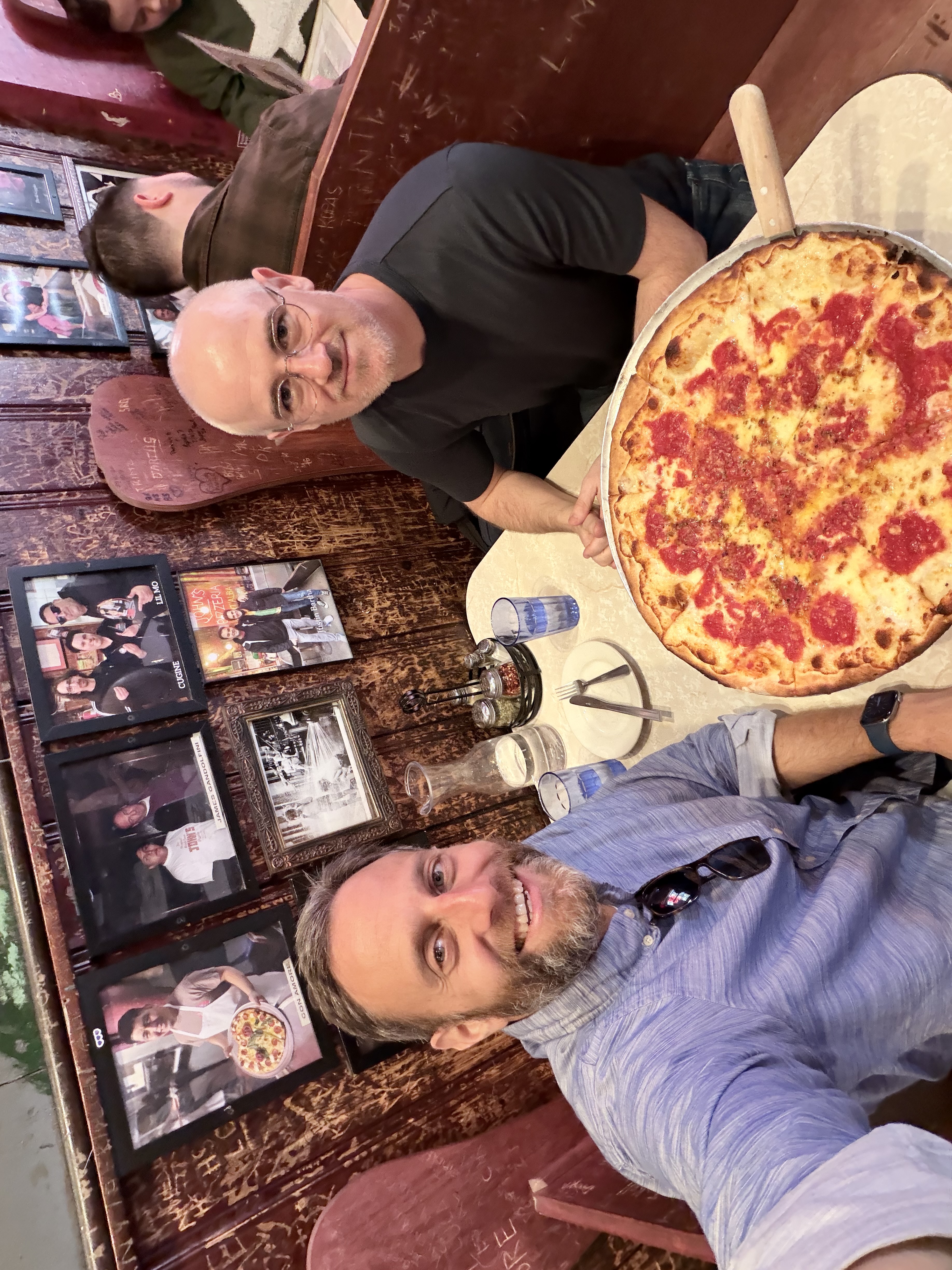
🍕
⏹️ ▶️ Marco I had a really great day yesterday. As did I, coincidentally.
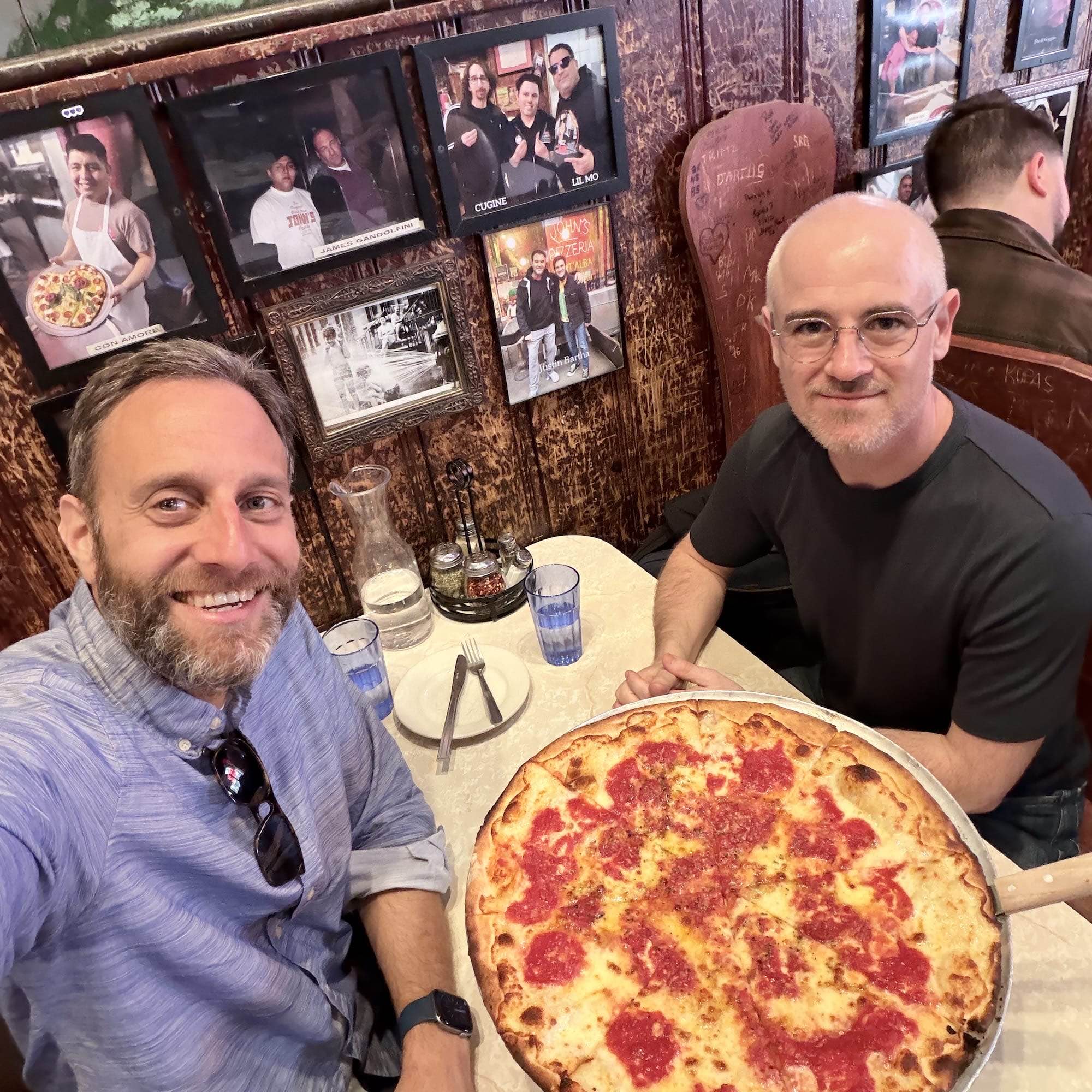
⏹️ ▶️ Marco Casey was visiting New York. We met up. We'll talk about wine a little bit. And then I got to eat
⏹️ ▶️ Marco half of a pizza for lunch.
⏹️ ▶️ Casey We're going to have to post it. It's funny you bring this up. I almost started like, posting pictures
⏹️ ▶️ Casey from yesterday. And I thought, you know what? Let's see how we handle it on the show.
⏹️ ▶️ Casey I am past the state. I think all three of us, well, probably Marco and me more than John, but
⏹️ ▶️ Casey I'm past the stage where I need to broadcast every ounce of my life to Instagram and whatnot. And I
⏹️ ▶️ Casey do enjoy posting things that are unique and different. But I thought, you know what? Let me keep this one
⏹️ ▶️ Casey close to the vest and see what we get into on the show. And so I will put a link in the show notes to
⏹️ ▶️ Casey Marco and I at John's of Bleecker before we absolutely destroyed
⏹️ ▶️ Casey an entire pizza. And the funny thing about this was we got to John's
⏹️ ▶️ Casey after some shenanigans in the morning, which we'll talk about. And, um, And by the way, when
⏹️ ▶️ Casey your phone is used to navigating by car, you need to tell it to navigate by foot when you're in New York City
⏹️ ▶️ Casey because I I was navigating on Marco before Marco and I to walk from somewhere to John's.
⏹️ ▶️ Casey And I think we took the most circuitous route possible. We might have walked through Brooklyn at some point or another to get to
⏹️ ▶️ Casey John's. In any case, eventually, when we were almost there, I realized, oh, these were
⏹️ ▶️ Casey driving directions. Whoops. But no, we got there and we were having
⏹️ ▶️ Casey a happy debate over should we get the smaller or the larger of the two size pizzas. There was
⏹️ ▶️ Marco Just always get the bigger pizza. Nobody ever is like, we have way too
⏹️ ▶️ Marco much pizza. No, $2 more to get a bigger pizza. Of course, get the bigger pizza for $2
⏹️ ▶️ Casey And that's what we did. And we polished off the entire pizza. And I had no regrets.
⏹️ ▶️ Casey Now I didn't eat dinner that night because I was still full, but no regrets. It
⏹️ ▶️ Casey was great. It was a really lovely time.
⏹️ ▶️ Marco We had a little bit of time to kill before we parted ways afterwards. And we were dragging.
⏹️ ▶️ Marco After eating an entire half pizza each. No amount of coffee could have
⏹️ ▶️ Marco kept us very awake after that.
ATP Store: 🏳️🌈🏳️⚧️
⏹️ ▶️ Casey We have important administrivia to take care of. It is
⏹️ ▶️ Casey time. Now, let's suppose you're walking in the streets of Manhattan. Perhaps you
⏹️ ▶️ Casey are, I don't know, walking in a circuitous route because you forget that you need to toggle over to walking directions.
⏹️ ▶️ Casey And you hear my voice, you hear these dulcet tones say to you, The ATP Holiday
⏹️ ▶️ Casey Store is back, baby. And if you want to, you should pull over, not block the sidewalk,
⏹️ ▶️ Casey and go to ATP.fm slash store. And you will see some
⏹️ ▶️ Casey genuinely fantastic work, pretty much entirely done by John Syracusa. So John, take
⏹️ ▶️ Casey it away, if you please. What do we have on store or in the store this time?
⏹️ ▶️ John Okay, well, so the theme for this year is John is disappointed that Apple doesn't put out better chips.
⏹️ ▶️ John So we have a bunch of logo shirts, including a leftover logo shirt that we should have made
⏹️ ▶️ John last sale, but we didn't. So anyway, to start, our first two shirts
⏹️ ▶️ John are shirts that we've been talking about for a long time, but haven't done. If you're
⏹️ ▶️ John familiar with our logo, our show logo, you might be looking at it now in your podcast player. It's a
⏹️ ▶️ John combination of the BMW M logo and the Rainbow six-colored Apple
⏹️ ▶️ John logo and the initials of our show, ATP, Accidental Tech Podcast, all in
⏹️ ▶️ John one logo. It's a great logo, okay? And it does, you know, the stripes, the BMW M-ish stripes, there's
⏹️ ▶️ John six of them because it's the same colors in the same order as they are on the old-style Rainbow Apple logo. And
⏹️ ▶️ John we've often talked about our logo and said, and also, if you wear that shirt and someone mistakenly
⏹️ ▶️ John thinks that's supposed to be like a pride flag logo, that's great too. Another meaning to throw into
⏹️ ▶️ John the thing because we support that. It's great. It's a happy accident. But we always had the idea,
⏹️ ▶️ John why don't we actually make ATP shirts with the pride colors in it? Because the
⏹️ ▶️ John Pride flag colors are actually different and in a different order than the Apple logo colors, which are different than the BMW M colors
⏹️ ▶️ John and so on and so forth. So we have done that this year. We have a shirt called ATP Pride and it uses,
⏹️ ▶️ John I always forget the name. I linked to it. I have to look it up again. Like the traditional Pride flag uh, with,
⏹️ ▶️ John what does it get? Red, orange, yellow, green, blue, and purple is the order. And I tried to copy
⏹️ ▶️ John the colors exactly. And those replace the Apple six colors logo. Okay. And we have
⏹️ ▶️ John a second shirt called ATP Trans Pride, which uses the Trans Pride logo, which has fewer
⏹️ ▶️ John colors, but then I just repeated. I think they repeated in the flag too. It's like blue, pink, white, pink,
⏹️ ▶️ John blue. It's actually a different number of stripes than the other one, but we made it work.
⏹️ ▶️ John And I think both of these shirts look great. So now your ATP logo shirt won't be mistaken for a Pride
⏹️ ▶️ John flag. It literally is choose the regular Pride flag. I forget what, again, I forgot what the name of it is, but it's like one of
⏹️ ▶️ John the older ones. And the Trans Pride flag. And they come
⏹️ ▶️ John in multiple colors, mostly neutral colors because they have like rainbow logos on them. But I really like the Trans Pride
⏹️ ▶️ John one that comes with like a light bluish or even the dark bluish shirt. And it seems to go well with
⏹️ ▶️ John the light blue and pink and white logos in there. And of course, it's not just t-shirts. It's long
⏹️ ▶️ John sleeve shirts and sweatshirts and pullover hoodies and all the things with those logos on it. So those two shirts, ATP Pride
⏹️ ▶️ John and ATP Trans Pride. And for these two shirts, we are donating 100%
⏹️ ▶️ John of the profits from the sales of these two shirts to LGBTQ charities.
⏹️ ▶️ John So I've chosen two charities for this one. It was very difficult for me to choose charities. I don't know a lot about this and I'm looking at
⏹️ ▶️ John like charity navigator and trying to find good things or whatever. Here's what I came up with. If I've picked terrible charities,
⏹️ ▶️ John tell me and we'll change them. But if it's just like you prefer a different charity, maybe next time, you know, again, let us
⏹️ ▶️ John know. Maybe next time we'll pick a different one. But here's what I picked for this one. Pick two charities. Again, 100%
⏹️ ▶️ John of the profits from both these shirts going to these charities. First one is Trans Lifeline. I'm reading from their website,
⏹️ ▶️ John but how they describe themselves. Trans Lifeline is a grassroots hotline and microgrants nonprofit
⏹️ ▶️ John organization offering direct emotional and financial support to trans people in crisis
⏹️ ▶️ John for trans for the trans community by the trans community. So this is like targeted on the ground. If
⏹️ ▶️ John you are in crisis, call this number. They will help you and they will give you money. And it's
⏹️ ▶️ John like you know, real kind of grassroots stuff. The second one is Transgender
⏹️ ▶️ John Law Center. Again, reading from their website. They are the largest trans specific trans-led
⏹️ ▶️ John organization in the United States. Their advocacy and precedent setting litigation victories
⏹️ ▶️ John in areas including employment, prison conditions, education, immigration, and healthcare protect and advance the rights
⏹️ ▶️ John of transgender and gender nonconforming people across the country. So my thinking
⏹️ ▶️ John behind picking these two is one, it's like a really you know, direct on the ground helping individual
⏹️ ▶️ John people thing. And two, the bigger picture fighting against the terrible laws that are happening in our country to
⏹️ ▶️ John try to take away rights from trans people. And you may be thinking, why are they two trans charities? What happens to just generic LGBTQ
⏹️ ▶️ John charities? Let me tell you, I had such a problem trying to find a non-problematic, generic
⏹️ ▶️ John LGBTQ charity uh, that wasn't like involved in some kind of scandal
⏹️ ▶️ John or other thing or whatever. So again, maybe I'll try again next time. But for now, I picked those two and I figured it's reasonable
⏹️ ▶️ John because right now in our country anyway, trans people are the ones getting it the worst. Everyone's getting it bad. Like,
⏹️ ▶️ John you know, marginalized people are not having a good time in America, period. But trans people are just
⏹️ ▶️ John really like they're the subject of half of the political ads and they're like such a tiny fraction of the population.
⏹️ ▶️ John It's brutal. So anyway, that's what we're doing with those. Oh, and by the way, I said we're donating 100%
⏹️ ▶️ John of our profits from these shirts. Also, Cotton Bureau is kicking in $2 for each shirt sale as well.
⏹️ ▶️ Casey I didn't know that. That's great. So there you go.
⏹️ ▶️ John We're not making a cent on those. They are entirely a charity thing. And I think the shirts look great. Please
⏹️ ▶️ John buy them if you can.
⏹️ ▶️ Casey Yeah, for what it's worth, John has genuinely done a really good job with both of these. And
⏹️ ▶️ Casey we've said this in the past. And if I were you, I probably wouldn't believe us. But hand to God, this is
⏹️ ▶️ Casey God's Honest Truth. We really don't make a lot from merch. We really, really don't. The costs for us
⏹️ ▶️ Casey are quite a bit higher than you think. I am fully aware that the cost for you
⏹️ ▶️ Casey is quite a bit higher than you would want. Honestly, it's quite a bit higher than we would want. But like John said,
⏹️ ▶️ Casey for the small amount that we would have earned off of these
⏹️ ▶️ Casey, Jonathan Mann two shirts, we
⏹️ ▶️ Casey will be giving 100% of that plus the $2 from Cotton Bureau. Thank you, fine folks at Cotton Bureau. We will
⏹️ ▶️ Casey donate that and we will follow up about it at a
⏹️ ▶️ John More on terrible profit margins as we go to later products. But yeah, like, and again, if
⏹️ ▶️ John you just want to donate to these charities directly, it will give them way more money than
⏹️ ▶️ John, Marco buying the shirt. But
⏹️ ▶️ John the shirts are cool. and And for the shirts, like, you know, I don't know how many like
⏹️ ▶️ John influencers we have listening. Steven Robles, if you're listening to the show, I know
⏹️ ▶️ John, Marco you wear like one of
⏹️ ▶️ John our M5 shirts or whatever. I would encourage people to buy one
⏹️ ▶️ John of these shirts and you're like, oh, are you telling them so they can put it on so they can virtue signal and say how wonderful they are? No. The reason
⏹️ ▶️ John you're wearing this is to let more people in the world know that you are essentially a safe
⏹️ ▶️ John person. Other people don't know what it means, don't care, whatever its logo is that, is that about tennis? Is
⏹️ ▶️ John that about, you know, BMW? Like, no one knows or cares. But the people who do know and care will
⏹️ ▶️ John see this shirt on you and hopefully understand that you are a safe person. And I think that's important. And also,
⏹️ ▶️ John you know, just being seen, right? People don't know what it is. Like if you, I, that's why
⏹️ ▶️ John I encourage like YouTubers to wear because I just want it to be out there in the world and for someone to come upon it and say, hey,
⏹️ ▶️ John there's someone who recognizes my humanity. Boy, it's such a low bar. So it sounds terrible when I say that. But anyway,
⏹️ ▶️ John there you go. Those two products. All right. So the next one is a shirt that I should have made last sale and I didn't. That's on me. My
⏹️ ▶️ John bad. We do shirts for like the M chips because it was like, can you believe Apple made chips starting with M
⏹️ ▶️ John and we have this BMW M based logo? Now we can combine them together. That was a happy accident.
⏹️ ▶️ John But then with the MacBook Neo, they put an A chip in a Mac.
⏹️ ▶️ John And all these shirts are like Mac chips, right? um Because I love Macs. They put an A chip in the Mac. And hey,
⏹️ ▶️ John our podcast begins with A. So we are making finally an A18
⏹️ ▶️ John Pro shirt because we've had things with the M chips with the Pro thing. And we had ATP shirt
⏹️ ▶️ John with an A. And now we have an A18 Pro shirt. We should have had it when the MacBook Neo came. We did
⏹️ ▶️ John have MacBook Neo shirts. You know, we had like the ones that were colored like the Neos. Those were really cool, but we forgot to make an A18
⏹️ ▶️ John Pro shirt. Now we have one finally. The mistake has been corrected.
⏹️ ▶️ John As for actual new chip shirts, Apple did come out with new chips. They're not great, but they exist.
⏹️ ▶️ John M5 Ultra and M5 Ultra Interposer shirts are here. I remember
⏹️ ▶️ John how excited I was about the original Interposer shirt, but now my description of it is that Apple just can't stop
⏹️ ▶️ John sticking Max chips together. Maybe a little bit snarky, but we've
⏹️ ▶️ John always had that shirt of like the two Maxes, like one is rotated and connected to the other one, right? Max Max. Anyway,
⏹️ ▶️ John so we do have M5 Ultra and M5 Ultra Interposer shirts. We always like to bring back one shirt from the
⏹️ ▶️ John past that we've sold in past sales. And this time we're doing the ATP graffiti shirt,
⏹️ ▶️ John which I think we only sold one other time and is actually one of my favorite shirts. My kids have a couple of these. I
⏹️ ▶️ John love it when they wear them. They seem to wear them a lot. Maybe it's because it's not that recognizable. But anyway, it's the ATP
⏹️ ▶️ John logo, but drawn in palms, graffiti, like the palm handheld, their
⏹️ ▶️ John graffiti handwriting recognition. Like they would have a little guide telling you how to do it. Like start with your pencil here and draw
⏹️ ▶️ John like this. So we're doing the ATP graffiti shirt again. And again, it's not just search. It's long sleeve sweatshirts, all that other
⏹️ ▶️ John stuff. Then, of course, we have the ATP logo shirt. We have the ATP zip hoodie, and the zip hoodie has
⏹️ ▶️ John expanded for the first time this year. So it's a good year to buy a zip hoodie. We've always sold, and it's a very nice, like soft
⏹️ ▶️ John black zip hoodie with an embroidered ATP logo on like the left chest. And my
⏹️ ▶️ John kids have these and they use them all the time. They're great. And it's black because this is the rainbow logo. It kind of clashes
⏹️ ▶️ John with some stuff. Well, this time we have, first of all, two new weights, one or two new weights of it. We have a medium weight
⏹️ ▶️ John and a heavy weight. I think the medium weight might be the same as normal weight. But anyway, we definitely have a new heavyweight weight of this. So you can get a thicker
⏹️ ▶️ John one if you want it. And you can get it in like grayish, bluish, white.
⏹️ ▶️ John It's like Apple products. It's like they're not really strong colors because the really strong colors would clash with
⏹️ ▶️ John the ATP logo because it's got so many colors in it, right? But you can get a white one and you can get a gray
⏹️ ▶️ John and like kind of like a coral greenish blue and a bunch of the point is you can get ATP zip hoodies
⏹️ ▶️ John in different colors and different weights now. So please check out that product. Now, finally, the bad news.
⏹️ ▶️ John The ATP polo, the cost, the cost to us, the cost of that polo blank shirt
⏹️ ▶️ John before we put our embroidered logo on it has gone up astronomically. Just, I
⏹️ ▶️ John don't even know if we're ever going to sell this again, but I figured because we just, we found out of this late breaking, it's like, uh-oh, the
⏹️ ▶️ John price got, so first of all, the price to you is going up by a lot too. But also,
⏹️ ▶️ John I cut the profit margins down to basically zero on this shirt. And this may be the last time we sell it
⏹️ ▶️ John because it costs so much money just for the blank shirt before we even put a logo on it, before there's any kind of profit.
⏹️ ▶️ John So our profits on the ATP polo shirt, if you buy it with the member
⏹️ ▶️ John discount, are measured in cents per shirt. Cents. And the only reason I did that
⏹️ ▶️ John is because I didn't want to have a dollar amount that was like fractional. I wanted to have an integer number of dollars
⏹️ ▶️ John and I didn't want to lose money in every shirt. So if you ever wanted an ATP polo shirt,
⏹️ ▶️ John you should probably buy it now and give us the, you know, handful of nickels and dimes
⏹️ ▶️ John that we're going to make on each one because we may never sell it again because the price is just so high. It is our fanciest shirt, as the
⏹️ ▶️ John description says. It is very nice. I have a couple of them. But boy, I don't know what happened with their price
⏹️ ▶️ John structure, but it is gone. Maybe they use Ram in the shirts or something. It's gone up by a lot.
⏹️ ▶️ John So yeah, get your polos while you still can. This may be the last time they're ever sold. And finally, we have the ATP hat, which
⏹️ ▶️ John is just a baseball hat with the embroidered ATP logo. All right. Sorry, I took so long. Those are the shirts. That's the store. Store will
⏹️ ▶️ John be open for three weeks. If you are an ATP member, remember to go to login to ATP.fm,
⏹️ ▶️ John go to your member page and get your ATP member discount code that will give you 15% off
⏹️ ▶️ John everything in the store. If you're not a member, just become a member, get the discount, and then cancel. It's really
⏹️ ▶️ John, Casey easy to do. No, no, no, no, no, no, no, no. You do this every time?
⏹️ ▶️ Casey do not have to cancel. I mean, you can cancel.
⏹️ ▶️ John You can also not cancel.
⏹️ ▶️ Casey We encourage you. Well, Marco and I, two-thirds of ATP,
⏹️ ▶️ Casey, John encourage you to not
⏹️ ▶️ Casey, John People do it all
⏹️ ▶️ John the time. We see it happen. We get a bunch of membership bumps. People buy from the store and then they cancel, which is fine. Like,
⏹️ ▶️ John get the discount. It's good. Also, gift memberships. That's also on the ATP.fm slash store page.
⏹️ ▶️ John If you want to ask for a gift membership so you don't have to pay for your own membership, you want to ask for it for the holidays, you can do that
⏹️ ▶️ John here. There's a link that you can copy and give people and say, here, click this link and buy it for me. You can buy
⏹️ ▶️ John a gift membership from somebody else, another nerdy person in your life you think might be want to be an ATP member. That's linked
⏹️ ▶️ John from this page as well. ATP store, again, you'll hear about this two more times and the store will be gone and Casey will
⏹️ ▶️ John yell at you. That's
⏹️ ▶️ Casey exactly right. Yep. So again, I will say this briefly. Every single time somebody
⏹️ ▶️ Casey reaches out and says, oh no, oh no, I'm the one.
⏹️ ▶️ Casey I did it this time.
⏹️ ▶️ Marco It really happens every time. Like Casey does this whole spiel because, and it
⏹️ ▶️ Marco sounds like it's a joke and it's not. It actually really happens every
⏹️ ▶️ John time. People do write in and joke to us about it, but then there's the legitimate people who are like, I know, haha,
⏹️ ▶️ John funny, but it actually happened.
⏹️ ▶️ Casey Yep. So be not that person. I almost said be that person. Don't be that person. And
⏹️ ▶️ Casey instead, go to atp.fm slash door. Thank you to John for sponsoring the show.
HomeView follow-up
⏹️ ▶️ Casey Uh, all right, let's start with some follow-up. Uh, we need to
⏹️ ▶️ Casey talk about the home view, and there's been a lot of like snarking and chuckling
⏹️ ▶️ Casey and also theorizing about: hey, when was this
⏹️ ▶️ Casey thing, this hardware, built? And according to Mark Gurman, finished units
⏹️ ▶️ Casey have been sitting boxed up in warehouses for the better part of a year waiting for software to catch up. Whoopsie-doopsies.
⏹️ ▶️ John Yeah, love, love that concrete info. Although when we get the hardware, presumably there's usually like some way to tell from like
⏹️ ▶️ John the serial number or something to know, but yeah, that's that's gotta hurt.
⏹️ ▶️ Marco I mean, it makes sense Like when you look at the hardware, like it is basically like regular
⏹️ ▶️ Marco Apple, you know, as I, as I kind of described as like, you know, they're like Apple's stock colors of aluminum. It's like,
⏹️ ▶️ Marco yeah, it's it's an aluminum, you know, bezeled screen on top
⏹️ ▶️ Marco of a HomePod subwoofer. Like that's, yeah, they could have made that years ago, and apparently they
⏹️ ▶️ Marco did. And yeah, the hard part was the software and Siri. So that
⏹️ ▶️ Marco this is, you know, a little bit interesting, but really not very surprising at all.
⏹️ ▶️ Casey Paul Hearing writes, I was surprised at how expensive HomeView is. It's almost four times the cost of
⏹️ ▶️ Casey an Amazon Echo Show 8, which lists for $149, but is almost always on sale somewhere for
⏹️ ▶️ Casey around $80. bucks.
⏹️ ▶️ John I couldn't believe those prices. So I looked up some prices and we will link to what I looked up. Again, Amazon changes prices all the
⏹️ ▶️ John time. So maybe by the time you follow these links, the prices will be different. But this is what I looked up.
⏹️ ▶️ Casey Or it could be that because you're the person following these links, maybe it'll
⏹️ ▶️ Casey price for you. But what John found was the Echo Show 5 was $100, Echo Show 8, $200.
⏹️ ▶️ Casey Echo Show $11, $250. Echo Show $15, $350. John,
⏹️ ▶️ Casey do you know enough about these to give me the two-second overview on what the differences are?
⏹️ ▶️ John I mean, I think the numbers are basically just screen size. So in that
⏹️ ▶️ John, Casey case, like with a
⏹️ ▶️ John five-inch screen, the Echo Show
⏹️ ▶️ John closer. But like it really just shows the range that Amazon Echo, Echo Show
⏹️ ▶️ John is their Amazon Echo thing with a screen on it. They have four models that span from 100 to 350.
⏹️ ▶️ John And so Apple still is kind of, they're at the high end of that range, but they're in the range. They're in the mix. Now,
⏹️ ▶️ John granted, you're going to say, okay, well, Amazon's $350 one has a 15 inch screen and Apple's
⏹️ ▶️ John $300 one has like a five-inch screen or a six inch screen. That's not close. Well, I still think it
⏹️ ▶️ John is a pretty reasonably priced product. Again, maybe because they did build them a
⏹️ ▶️ John but we'll see if the price suddenly increases if they actually sell through all the home views that they made,
⏹️ ▶️ John which is not a sure thing given how long it took them to try to sell through the big home pods.
⏹️ ▶️ Casey And we had some interesting thoughts, genuinely interesting thoughts about um wall mounts
⏹️ ▶️ Casey and pricing and whatnot. So MVK writes, my theory is that if the wall mount was priced less than the tabletop
⏹️ ▶️ Casey version, people would buy it to save money, but never mounted. The majority of units in the wild in that scenario would be
⏹️ ▶️ Casey flat on tables or stood up with janky, cheap hardware and never hung. So including a bass speaker for quote-unquote
⏹️ ▶️ Casey free ensures the majority of them that get sold will actually look good in homes. I can't
⏹️ ▶️ Casey decide. I waffle back and forth if I think this is 100% right or 100%
⏹️ ▶️ John wrong. I don't think Apple cares how it looks in your home because no one's going to, you know, someone comes over and see that they'll think
⏹️ ▶️ John it's junky, but like, man, people do all sorts of stuff with Apple hardware as it is. But it's an interesting theory. I mean,
⏹️ ▶️ John we'll get one more theory and then I'll give my, what I think is the more obvious answer. But anyway.
⏹️ ▶️ Marco Yeah, I think this is more of a justification than a reason. I think it's like
⏹️ ▶️ Marco post-hoc like, well, we want to capture as much money as possible from professional installers
⏹️ ▶️ Marco and high-end builds. Well, This is also a reason that this might be a decent idea.
⏹️ ▶️ Casey So Ben-O-Matic writes, if the wall-mounted model was even $50 less, Amazon would explode with cheap base
⏹️ ▶️ Casey units, with speakers, with a mount and a USB-C connector. My guess is that Apple doesn't want to incentivize a market
⏹️ ▶️ Casey that'll result in lots of cheap off-brand versions of the product on countertops and in social media feeds.
⏹️ ▶️ John I think that Amazon's still going to have tons of mounts for these things.
⏹️ ▶️ John, Casey Because remember, the
⏹️ ▶️ John ones that Apple commissioned from like Schneider Home or whatever are insanely expensive. So you're still going to see all that
⏹️ ▶️ John stuff. But yeah, there's lots of theories about how if they made them a different price, everyone would buy the one without a base. But I'm not sure
⏹️ ▶️ John about that because I think people like the speaker, I mean, the speaker part of it. And if they know they're getting one with,
⏹️ ▶️ John it so clearly doesn't have any place for a big speaker in it. Anyway, like, I think they're
⏹️ ▶️ John just the same price because that's just an Apple thing to do. Right. It's kind of amazing that
⏹️ ▶️ John that's not true of some Apple products. Like they for a lot of the past, you know,
⏹️ ▶️ John monitors with and without the, like you complained about it, didn't the Visa mount was the same price as the one without it,
⏹️ ▶️ John adjusted it. It's rare when Apple does actually make that kind of adjustment. Usually it's just, this is the price of the product
⏹️ ▶️ John and you can get the wall mount or not. And yeah, the cost to us is different, but we don't pass that on to you. And that's just the
⏹️ ▶️ Casey All right. Jan or Jan probably, Wetikind writes, Wedikind. I'm so sorry. Just pick one of
⏹️ ▶️ Casey those and hopefully it worked right. The best thing about the home view is, is the dozen Chinese
⏹️ ▶️ Casey copies that will drop very soon, probably with OLED and a Linux variant. So we can tinker with Home Assistant.
⏹️ ▶️ Casey To be clear, this is not my pseudonym. I did not write this, but I agree with the sentiment.
⏹️ ▶️ John Yeah, it's interesting. One of the effects that Apple has is regardless of whether
⏹️ ▶️ John or not what Apple has done is a good idea, is it a good idea to have a little Archer D2 with it
⏹️ ▶️ John with an arm and a screen on it? Doesn't matter if it's a good idea. If Apple does it, people will
⏹️ ▶️ John copy it because it looks like Apple. And so you hope the thing that Apple does turns out to be a good
⏹️ ▶️ John idea so that the copies are good products. But very often, the copies are just like Apple
⏹️ ▶️ John in all of the good and bad ways. And if Apple does something stupid, then you have a million stupid copies. Remains to be
⏹️ ▶️ John seen if the HomePod form factor or the home view, I did it again, the HomeView form factor
⏹️ ▶️ John is in fact the right size and shape for that. But either way, there will be copies.
⏹️ ▶️ Casey Jimmy writes, quote, who's going to have a hole in their kitchen island to snake a
⏹️ ▶️ Casey USB-C cable down? Quote, me. And Jimmy provided a very
⏹️ ▶️ Casey helpful image where there is one of those like desk grommets. Is that the word I'm
⏹️ ▶️ Casey, Jonathan Mann looking for?
⏹️ ▶️ Casey uh that has a what appears to be an iPad on a mount coming uh being
⏹️ ▶️ Casey powered by power that runs through the grommet. And one of the, is that the 12 South Dingus that
⏹️ ▶️ Casey you can charge, like the travel dingus, something like that. Anyway, the we'll put a link in the show notes the picture uh But yeah,
⏹️ ▶️ Casey sure enough, in a grommet through the kitchen table.
⏹️ ▶️ John Well, yeah, so it looks like there's like marble or some kind of stone in one half and then wood on the other. And thankfully they put the hole
⏹️ ▶️ Marco Right. Now, that being said, like I assume this was kind of a dig at John Gruber's review where he pointed out
⏹️ ▶️ Marco like no one ever has a hole in their kitchen island for this.
⏹️ ▶️ Marco, John We said that
⏹️ ▶️ Marco, John I thought we said it as well. Everybody said it.
⏹️ ▶️ Marco Yeah. And I think like it is true that most kitchen islands don't
⏹️ ▶️ Marco have holes in the middle of them. And one of the biggest reasons why, I mean, besides the fact that people tend not to have
⏹️ ▶️ Marco new kitchen islands installed that often. And so it's it's not something that you get that you know
⏹️ ▶️ Marco every couple years you have to reevaluate your needs. uh but also um you do have to worry about
⏹️ ▶️ Marco like, what if liquids spill and pour into that? What are they pouring into? And
⏹️ ▶️ Marco is it going to damage anything? Are you going to be able to clean it? Is it going to be a problem? And so, yeah,
⏹️ ▶️ Marco most of the time, it people don't design things this way. So it is a valid complaint
⏹️ ▶️ Marco of like how you can plug this thing in. But I also think like most people are not going to have the home
⏹️ ▶️ Marco view in the middle of an island.
⏹️ ▶️ Marco a weird position. They're going to have it like, you know, when you look at where do people put Amazon Echoes and stuff, they
⏹️ ▶️ Marco put them like against the wall. First of all, they put them where the outlets are, but they put them like in the corner
⏹️ ▶️ Marco or on the part of the island that touches the wall or whatever. It's not something that
⏹️ ▶️ Marco people, despite the weird Apple commercial, like are going to be swiveling around all the time. Like I think
⏹️ ▶️ Marco mostly it goes like in a corner or against a wall.
⏹️ ▶️ John As I alluded to last time, I think it is currently against code in at least some states
⏹️ ▶️ John in the U.S. to have outlets on the side of kitchen islands that used to be allowed. And I think they changed it. I might be wrong about
⏹️ ▶️ John that, but there's a bunch of electrical issues. Let's just say electrical issues related to kitchen islands
⏹️ ▶️ John and where they get power. And like you said, what's going on underneath the kitchen island.
⏹️ ▶️ Marco Yeah, I believe it was explained to me when we did a kitchen renovation a few years ago. And we
⏹️ ▶️ Marco were actually told specifically that they can't put an outlet on the side of the island anymore because apparently
⏹️ ▶️ Marco the rationale that this electrician said was that people can like, if you walk by it and you accidentally
⏹️ ▶️ Marco pull something, like if you hit the outlet and you pull something off the counter that's electrically powered, that
⏹️ ▶️ Marco can be bad. And typically the codes are designed to avoid hazards like that.
⏹️ ▶️ Casey All right. We have a couple more notes with regard to the homepod. uh now I did it.
⏹️ ▶️ Casey Derek Martin writes, I was surprised to see that the home view screen doesn't have identical dimensions to the duo screen
⏹️ ▶️ Casey because they're so close and it could save developers time and money. I'm with you on
⏹️ ▶️ Casey it seems like it would have been similar, but I don't really think it's going to save developers much time because there really is no third-party
⏹️ ▶️ John it's not an app platform. Like CarPlay already adapts to a bunch of different sizes and shapes. So I get the idea
⏹️ ▶️ John if it was 1.4 by 1 instead of 1 by 1, But I think it being square definitely is the design
⏹️ ▶️ John they were going for with the little cute factor.
⏹️ ▶️ Marco But also so much of the UI is widgets and
⏹️ ▶️ Marco things that are basically widgets in new contexts. And the developer
⏹️ ▶️ Marco story for this, I mean, first of all, the reason I laughed is that Apple does not care to
⏹️ ▶️ Marco save developers time and money ever. That's
⏹️ ▶️ Marco true. That is the last thing they think. Apple will prioritize what's the coolest version of this product we can
⏹️ ▶️ Marco make, period. And developers, do what you got to do. Like that's it. But anyway,
⏹️ ▶️ Marco the main developer story here is widgets. And there is a small square
⏹️ ▶️ Marco category of widgets, the same one on your iPhone. If you do like, you know, the smallest widget size, it's like it's two by two
⏹️ ▶️ Marco square icons. That size is what's shown in standby mode.
⏹️ ▶️ Marco And developers, like that's the only thing we can really do. And it seems to be using that same kind of
⏹️ ▶️ Marco system. And so they just blow that size up and show it at larger
⏹️ ▶️ Marco pixel densities, render, but it's still that class of widget being
⏹️ ▶️ Marco shown here. Those widgets are square. And so Apple can very easily tile a two
⏹️ ▶️ Marco by two grid of them and do whatever they want over there. So I think there's a lot of things they're taking advantage of with
⏹️ ▶️ Marco like doing a square screen for a bunch of square widgets that are both theirs and third-party. And
⏹️ ▶️ Marco as for the CarPlay API side of things, CarPlay screens have never been fixed resolutions
⏹️ ▶️ Marco and sizes. They've always varied and been kind of like a general
⏹️ ▶️ Marco class of interaction that like, well, you can expect to have approximately this minimum size,
⏹️ ▶️ Marco but it can also be massive or it can be different shapes and have different capabilities. And CarPlay
⏹️ ▶️ Marco itself is fairly adaptive to different sizes. So in this particular case of the
⏹️ ▶️ Marco home view, these concerns were not that significant.
⏹️ ▶️ Casey Finally, from Rick Allen, will Marco be adding CarPlay support to Unforgetful so it will
⏹️ ▶️ Casey show up and work on the home view?
⏹️ ▶️ Marco This, reading this in the show notes earlier, is the first time I've ever considered this.
⏹️ ▶️ Marco I don't know if Apple would let a reminders app apply for the CarPlay
⏹️ ▶️ Marco entitlement and get it. Because not everyone can actually make CarPlay apps. Reminder, look out for that
⏹️ ▶️ Marco So you have to apply for the special CarPlay entitlement and then you have to agree to a
⏹️ ▶️ Marco bunch of conditions. Things like you're not going to kind of wedge a game into it
⏹️ ▶️ Marco so people would be distracted while driving by playing your text adventure through CarPlay or whatever. You have
⏹️ ▶️ Marco to agree to certain terms that you're going to be you know, reasonably safe and not try to get around restrictions
⏹️ ▶️ Marco and stuff like that. But Apple is, I believe, human reviewing all of those. I think.
⏹️ ▶️ Marco They at least used to be. And I think they still are. So I don't think they would let that in.
⏹️ ▶️ Marco But if they did, not a bad idea.
Sponsor: Zocdoc
⏹️ ▶️ Marco We are sponsored this episode by ZocDoc. ZocDoc helps you find
⏹️ ▶️ Marco doctors and book appointments easily. This is really great for me personally. I've moved a
⏹️ ▶️ Marco few times in my life, and you know, every time I got to find a new doctor, more recently, I've had to change health
⏹️ ▶️ Marco insurance a lot as I was independently employed and buying off the marketplace. And a lot of times, you got to change doctors when your
⏹️ ▶️ Marco insurance changes. And it's just so hard to find doctors, especially when you need some kind of specialty.
⏹️ ▶️ Marco Like, oh, now I have to find an allergist or whatever. It's such a pain. And then, you know, you got to sign up for
⏹️ ▶️ Marco somebody's portal and book some appointment through something. You can't call anybody anymore. It's just,
⏹️ ▶️ Marco it's something that it's easy to put off. And ZocDoc helps solve this problem. ZocDoc
⏹️ ▶️ Marco lets you easily find and compare local doctors who are in network for
⏹️ ▶️ Marco whatever your insurance is. They have more than 150,000 providers within 200
⏹️ ▶️ Marco specialties across all 50 U.S. states. And every doctor has reviews from
⏹️ ▶️ Marco real patients on ZocDoc. They have detailed profiles, so you can help choose the right
⏹️ ▶️ Marco one for you. Once you choose, you can see actual appointment openings that those doctors have, and
⏹️ ▶️ Marco you can instantly book a visit with a click. It's so fast to get appointments, often
⏹️ ▶️ Marco within just one to three days. You can even sometimes score same-day appointments with doctors, so you don't
⏹️ ▶️ Marco have to wait, you know, months to find somebody who's available. It's wonderful. And ZocDoc is, of course,
⏹️ ▶️ Marco free to use. Your health matters, and taking care of yourself shouldn't be
⏹️ ▶️ Marco complicated. Ready to be seen? Head to ZocDoc.com slash ATP to
⏹️ ▶️ Marco get started and check that appointment off your to-do list. That's ZocDoc spelled Z-O-C-D-O-C
⏹️ ▶️ Marco dot com. ZocDoc.com slash ATP. Thank you so much to ZocDoc
⏹️ ▶️ Marco for sponsoring our show.
Apple TV follow-up
⏹️ ▶️ Casey All right, let's talk Apple TV. We had some discussion with regard to the price history.
⏹️ ▶️ Casey John, can you tell me about this YouTube link, please?
⏹️ ▶️ John Yeah, I had a recollection of this, but didn't remember the details, so I looked it up afterwards. And here we are. In
⏹️ ▶️ John the Apple event in March 2015, I forget what kind of event it was, but I don't think it
⏹️ ▶️ John was like a major one. At that event, Apple lowered the price of the Apple TV from
⏹️ ▶️ John $99 to $69. I had totally forgotten that it was that low. I
⏹️ ▶️ John was going to guess that they had lowered it to $99. No, they lowered it to $69. So that $69
⏹️ ▶️ John in March 2015 is equivalent to $100 today, roughly. So still pretty cheap.
⏹️ ▶️ John And this was the third generation Apple TV, basically the one before the Apple TV HD
⏹️ ▶️ John was introduced in September of 2015. So it was kind of the end of life of the non, the pre-HD
⏹️ ▶️ John Apple TV, but it was still that same black puck. I think it was a different, you know, it was like flatter
⏹️ ▶️ John and squatter or whatever. But anyway, just to give you an idea of how far we've come for Apple TV prices.
⏹️ ▶️ John Again, I'm not counting like the weird other one that ran like macOS 10.4 variant
⏹️ ▶️ John or whatever. I'm talking about the little black puck thingy. You could get it for $69 in 2015.
⏹️ ▶️ John Glenn Feischen made a chart of all of them, including inflation adjusted numbers and the actual price adjustments
⏹️ ▶️ John and absolute values. And it's fascinating to look at, although a little bit confusing, but we will link it in the show notes.
⏹️ ▶️ Marco And John, just as a reminder, what's the price of the current Apple TV remote by itself? It's
⏹️ ▶️ Marco close. It's $59. Yeah,
⏹️ ▶️ John $59 for the remote.
⏹️ ▶️ Casey All right. Microphones. There's some new Farfield microphones in the Apple TV box
⏹️ ▶️ Casey itself. And Jason writes, have fun trying to get the new Apple TV to answer any of your questions without the four
⏹️ ▶️ Casey HomePods nearby hijacking the Siri requests with the grimacing emoji.
⏹️ ▶️ John Because that's the picture they show. They always show like, oh, your Apple TV and the four home pods. Good luck talking to the little
⏹️ ▶️ Casey Uh, That is true. However, uh, if you're a learned individual, you don't have
⏹️ ▶️ Casey any home pods in your house and you don't have to worry about this.
⏹️ ▶️ John Yeah. And to be clear, according to Apple, and a lot of the time
⏹️ ▶️ John this works, Apple's devices will coordinate with each other so that they don't all answer. They
⏹️ ▶️ John will figure out who's supposed to answer. Uh, They will pick the quote unquote best one and that one will answer. That's how it's
⏹️ ▶️ John supposed to work. Sometimes it does work that way. But if you have a lot of Apple devices,
⏹️ ▶️ John you know it doesn't always work that way. For example, if you say, hey, Dingus, to your phone that's on the desk in front of
⏹️ ▶️ John you and you hear a HomePod three rooms away answer, you know that
⏹️ ▶️ John this system remains imperfect.
⏹️ ▶️ Casey Indeed, it does. All right, with regard to AV1, which the following is via Michael Barnes,
⏹️ ▶️ Casey among others, the new Apple TV has AV1 hardware decoding, thanks to its A18 SOC.
⏹️ ▶️ Casey Here's the feature comparison of the second, third, and fourth gen Apple TV models from Reddit. Rebit.
⏹️ ▶️ Casey It's Ribbit and Reddit put together. Anyway, from Reddit. All right, so then with that in mind, we can
⏹️ ▶️ Casey look at the announcement dates for the last few generations of Apple TV, starting from the oldest,
⏹️ ▶️ Casey April 20th of 2021. Then April 18th of 2022,
⏹️ ▶️ Casey a scant 546 days later. Then after that, October
⏹️ ▶️ Casey 13th of 2026, 1,456
⏹️ ▶️ John That's the thing that stood out to me on
⏹️ ▶️ John, Casey this chart. The chart
⏹️ ▶️ John was basically saying who, you know, which things have AV1 hardware decoding or whatever, but also had the release dates. And it's like, boy, yeah,
⏹️ ▶️ John those are stretching out a lot, aren't they?
⏹️ ▶️ Casey really not great. It's also worth noting that YouTube and Netflix both desire to
⏹️ ▶️ Casey and do encode things in AV1. Now, will this get sent to the Apple TV? Who knows?
⏹️ ▶️ Casey But that is what they use. They at least vend that to other devices.
⏹️ ▶️ John Yeah, that's what people are excited about AV1 because it's like, hey, better picture quality with the same bandwidth or sometimes
⏹️ ▶️ John better picture quality with even lower bandwidth. It's a better codec, yada, yada. So that's why people,
⏹️ ▶️ John that's why you might care that your Apple TV has AV1. But it only matters if either
⏹️ ▶️ John using some app like Infuse or something that can, you know, read AV1 files and decode it on the hardware,
⏹️ ▶️ John or if big services like YouTube, Netflix, and other streamers actually start somehow
⏹️ ▶️ John detecting that you have AV1 hardware decoding and start sending you an AV1 encoded stream that it looks
⏹️ ▶️ John better than the previous streams. But who knows if they'll even do that? That's kind of up to Apple to coordinate with
⏹️ ▶️ John them. And it's debatable whether anyone would even know. But eventually, I don't know, let's say 20
⏹️ ▶️ John years from now, they'll all have AV1 hardware decoding. And then, you know, streaming services
⏹️ ▶️ John can all switch to it.
⏹️ ▶️ Casey All right. John, there are a lot of very, very grumpy nerds
⏹️ ▶️ Casey that Apple did not include the thing that they must include in the new Apple TV.
⏹️ ▶️ Casey How could they not, John Syracusa? And Andrew Haglund was one of the
⏹️ ▶️ Casey people who was curious about what does this even mean? So Andrew writes, what do you mean when
⏹️ ▶️ Casey you say that the new Apple TV does not have audio pass-through? And I will add as a corollary,
⏹️ ▶️ Casey why do we care? So I thought you were going to jump in there, but you didn't. And that's fine.
⏹️ ▶️ Casey I will move right along and tell you that Caleb Dennison has a YouTube short,
⏹️ ▶️ Casey I think. Whatever it is, it's a short YouTube video where Caleb explains. And Caleb
⏹️ ▶️ Casey says, the Apple TV 4K has always taken a bitstream audio signal from streaming services or your personal
⏹️ ▶️ Casey media collection and converted it into a signal that is ready to be amplified by your receiver or a
⏹️ ▶️ Casey TV or a soundbar. The problem is that when Apple does the conversion, it's stripping out a bunch
⏹️ ▶️ Casey of information from the audio signal, which prevents your receiver or soundbar from having certain kinds of control
⏹️ ▶️ Casey over it. It can affect receiver and soundbar dialogue normalization features, so, you know, bringing up
⏹️ ▶️ Casey the volume of dialogue and only dialogue, for example, or how channel levels can be adjusted. And a lot of
⏹️ ▶️ Casey users report that Apple's audio output doesn't sound as dynamic, punchy, or interesting as the output from other streaming
⏹️ ▶️ Casey devices. Audio pass-through, or lossless audio passthrough, allows the signal to go straight
⏹️ ▶️ Casey through the Apple TV 4K to your soundbar or receiver, where you have more control
⏹️ ▶️ Casey and sometimes get better sound.
⏹️ ▶️ John And that's why AV nerds are upset about it continuing to not be there, because they probably
⏹️ ▶️ John have a fancy receiver, or at the very least, some kind of soundbar, some other equipment that they bought because of
⏹️ ▶️ John its features, because of the control it gives them over the sound or whatever. Regular people who are just connecting their Apple
⏹️ ▶️ John TV to the TV and don't have any external speakers don't care about this. But yeah, the the audiovisual nerds are like,
⏹️ ▶️ John come on, give us pass-through because they don't want the Apple TV doing this role. They have other
⏹️ ▶️ John equipment that they want to use for that purpose, that they bought for that purpose. It should just be a software change. It should be a thing
⏹️ ▶️ John they can roll out anytime they want. But yeah, they're annoyed that it doesn't exist. I mentioned it last episode a couple times so i didn't explain
⏹️ ▶️ John what it was. And Cale Dennison is one of my favorite TV reviewer
⏹️ ▶️ John people who recently went independent after quite a struggle. So check out his channel.
iPhone Duo cover layer
⏹️ ▶️ Casey Finally, for follow-up, Apple says the iPhone Duo has a replaceable cover layer, as they
⏹️ ▶️ Casey call it, above the display. Joe Rosignol at MacRumors writes: In a recent interview with content
⏹️ ▶️ Casey creator Angelica Siliani-Fendi, Apple's vice president of hardware engineering, Kate Bergeron,
⏹️ ▶️ Casey revealed that the iPhone Duo's nano-texture cover layer above the inner display can be removed and replaced.
⏹️ ▶️ Casey Quote, it's actually replaceable, which is a really nice thing for the customer that you can peel off that layer and get a new
⏹️ ▶️ Casey one, said Bergeron. To be clear, Kate Bergeron is not saying that one
⏹️ ▶️ Casey of us will peel this off.
⏹️ ▶️ Casey You do not want to do that. That's very bad. So continuing from Joe. In the U.S.,
⏹️ ▶️ Casey customers who purchase Apple Care Plus coverage for the iPhone Duo can get the cover layer replaced for $19, according to Apple's
⏹️ ▶️ Casey website. The cost to replace the cover layer without coverage has yet to be disclosed, or at least at the time of writing of that
⏹️ ▶️ Casey, John Yeah, I think it's
⏹️ ▶️ Casey was going to say, I thought we had seen a price since then. Anyways, the cover layer helps to hide the crease in the middle
⏹️ ▶️ Casey of the foldable inner display. Bergeron said Apple did a, quote, significant amount of engineering work,
⏹️ ▶️ Casey quote, to ensure that this layer remains in good condition for as long as possible, but customers will have the option to replace it
⏹️ ▶️ Casey if it wears down or the crease becomes more visible over time.
⏹️ ▶️ John It's kind of amazing that this wasn't mentioned in the keynote, but when we were talking about it before, especially when the rumors about using it with the stylus
⏹️ ▶️ John came out, it's like, all right, so it's a matte surface and it's bending and you can use it with a stylus. What is going to happen
⏹️ ▶️ John in terms of wear and tear on that surface? Because it can't be a piece of glass like on the nanotextured
⏹️ ▶️ John iPad because it bends. although it is like it's a very thin piece of glass. You know what I mean? You know what I mean? It can't be like
⏹️ ▶️ John a rigid piece of glass that doesn't bend. And so what is this going to be like
⏹️ ▶️ John in terms of durability? And the answer is that it's just a wear item. It's like brake pads, right?
⏹️ ▶️ John You use it. And if it starts getting scuffed or messed up, you can replace it. And
⏹️ ▶️ John relatively cheaply. Again, if you have Apple Care Plus, you have Apple Care Plus $20. Can you think of
⏹️ ▶️ John any repair to any Apple product, even with Apple Care Plus, that costs $20? That's pretty cheap.
⏹️ ▶️ John And without Apple Care Plus, I believe it is $50. Of course, if you have to replace
⏹️ ▶️ John the entire screen, that's $1,000. So yeah, it's good that it has a wear layer on top,
⏹️ ▶️ John but keep in mind that because it has a wear layer, that probably means that layer will in fact wear.
⏹️ ▶️ Marco That being said, though, the reviewers, some of the reviewers have tested the durability
⏹️ ▶️ Marco of that layer, and it seems pretty good. Obviously, it's not invincible.
⏹️ ▶️ Marco Nothing is, but it seems like from the tests so far that it is seemingly
⏹️ ▶️ Marco better than people think. It isn't just like a piece of plastic. It seems like it's actually.
⏹️ ▶️ Marco, John I mean, it is
⏹️ ▶️ John a piece of plastic. It's just a good piece of plastic.
⏹️ ▶️ Marco Well, yeah, it isn't like an $8 Amazon screen protector. It
⏹️ ▶️ Marco seems like it's pretty sturdy.
Duo hands-on thoughts
⏹️ ▶️ Casey All right. So, Marco, what were you doing yesterday out of curiosity?
⏹️ ▶️ Marco I was at an iPhone duo, I believe it was called a Creator Showcase. Was that
⏹️ ▶️ Marco it was an event that Apple put on in Manhattan that where they invited a bunch
⏹️ ▶️ Marco of people from the press and a bunch of developers. And the developers,
⏹️ ▶️ Marco It was like it was kind of like a mini keynote situation where like it's like, you know, these developers have been, you know, we brought
⏹️ ▶️ Marco them in from various companies, you know, people like Netflix, MLB, the New York Times, like, you know,
⏹️ ▶️ Marco you know, high profile or in a few cases, some indie developers. And they've they've had a few weeks with duo
⏹️ ▶️ Marco units to develop and make really cool versions of their apps on them. And then so they invited members of the press
⏹️ ▶️ Marco to come basically walk around and handle the iPhone duo ahead of time
⏹️ ▶️ Marco of the of the official release tomorrow and you know, play with these
⏹️ ▶️ Marco fun apps that these companies had made and have representatives from the companies like, kind of give
⏹️ ▶️ Marco little tours and show off their apps and kind of you know, basically like exactly, I think,
⏹️ ▶️ Marco you know, Apple used the word showcase. I think the showcase is a perfect word for it. It was like a demo event where we
⏹️ ▶️ Marco got to walk around. Casey and I got to actually like, you know, handle the iPhone Duo and use it in this
⏹️ ▶️ Marco you know, somewhat limited way, but still like, we got to actually hold it and see it. And you know, so that was
⏹️ ▶️ Marco really cool. And of course, as I mentioned earlier, Casey and I got to see each other, which was also really nice.
⏹️ ▶️ Marco Yep. Um, Not at a Jam Band concert this time.
⏹️ ▶️ Casey Although next time it will be again.
⏹️ ▶️ Casey, Marco Yeah, we'll make up
⏹️ ▶️ Marco for it really quickly.
⏹️ ▶️ Marco worry. Um, but, uh, it was really fun. Uh, It was a really cool event. Um, And we got to
⏹️ ▶️ Marco handle the duo. And that was also really fun.
⏹️ ▶️ Casey Yeah. So um, I have a ton of thoughts, all of
⏹️ ▶️ Casey which are extremely poorly considered, because while we did go around
⏹️ ▶️ Casey to all these like stations, um, to kind of try all these different apps and whatnot,
⏹️ ▶️ Casey we weren't being monitored in the sense that we could do whatever we wanted with these phones within reason.
⏹️ ▶️ Casey But at least for the two of us, I'm pretty sure I can speak for Marco in saying that we didn't want to just sit there and go screwing
⏹️ ▶️ Casey around with other people's apps as somebody is trying to engage with us about their particular app. So
⏹️ ▶️ Casey we got to play with the duo some. I folded and unfolded it a zillion times. I got to have a look
⏹️ ▶️ Casey at it. The reactions I'm having today are based on what happened
⏹️ ▶️ Casey yesterday morning. And tomorrow morning, in less than 12 hours, in theory,
⏹️ ▶️ Casey I will have my iPhone. Oh, spoiler alert, but I will have my iPhone duo in my hand. So now I'm
⏹️ ▶️ Casey jumping ahead and John's very angry at me. My bad. But suffice to say, these
⏹️ ▶️ Casey thoughts are poorly considered and I am reserving the right to completely change my mind. But
⏹️ ▶️ Casey with that said, the device, from a hardware
⏹️ ▶️ Casey perspective, is extremely cool. It is extremely, extremely
⏹️ ▶️ Casey cool. It's heavy, but not in an off-putting way, or at least I didn't think so.
⏹️ ▶️ Casey And Marco, please interrupt me if you have thoughts.
⏹️ ▶️ Casey, Marco Oh, I have lots
⏹️ ▶️ Marco of thoughts. Don't worry. You get through
⏹️ ▶️ Marco, Casey yours first.
⏹️ ▶️ Casey Don't worry. So it was heavy, but not in a
⏹️ ▶️ Casey burdensome way. It felt like sturdy, for lack of a better word.
⏹️ ▶️ John topic of weight, by the way, I don't know if we get to the other iPhone Duo reviews, we'll have this, but I was surprised a couple of
⏹️ ▶️ John them pulled out the actual weight in grams of the iPhone Duo, which I hadn't really compared to the other phones.
⏹️ ▶️ John It's not actually that much more than the iPhone Pro
⏹️ ▶️ John Max, or maybe it was slightly less. I forget. I'll have to look it up, but it's within the ballpark of
⏹️ ▶️ John the Pro Max, which surprised me because I just assumed it would be so much heavier than their Pro Max. But yeah,
⏹️ ▶️ John as with anything with the perception of weight, if you make a very small thing that weighs the same amount as a very large
⏹️ ▶️ John thing, the large thing feels lighter. And that's definitely an effect there.
⏹️ ▶️ Marco Yeah. Well, and also, like, you know, it is heavier than the Max. It's like 250 something grams, grams of, and the Max
⏹️ ▶️ Marco is somewhere, and the Pro the pro is like 220 something. and the Max is kind of somewhere in the middle. But
⏹️ ▶️ Marco those kind of weight differences, you know, going from like 220-something to 250-something, that
⏹️ ▶️ Marco matters a lot, like, especially in perceptual feel. And for something that you're holding
⏹️ ▶️ Marco in your hands and is bouncing around in your pockets, like that, those differences matter a
⏹️ ▶️ Marco lot. You know, like we're, we are, as we'll talk about later, we are somewhat close to what
⏹️ ▶️ Marco we expect to be an event where we're going to have lighter laptops announced. And if laptops shrink
⏹️ ▶️ Marco by, you know, 10 or 15% in weight, that's very noticeable. Like it
⏹️ ▶️ Marco matters. It matters a lot.
⏹️ ▶️ Casey Yeah. So the weight, I didn't find bad. The hinge, the operation of
⏹️ ▶️ Casey the hinge using the hinge, absolutely, and reviewers have clocked this as well. Absolutely
⏹️ ▶️ Casey a two-handed thing. I don't suspect that that's something that people will be able
⏹️ ▶️ Casey to do with one hand, or at least not easily. But don't don't hear what I'm
⏹️ ▶️ Casey not saying. It's not hard to use the hinge. It's just calibrated,
⏹️ ▶️ Casey for lack of a better word, that you're going to need two hands to do it.
⏹️ ▶️ John Weight update. iPhone Duo, 254 grams. iPhone
⏹️ ▶️ John 18 Pro Max 249. It is a five gram difference.
⏹️ ▶️ Marco Oh, that's really not much. And then what's the regular size Pro? 211.
⏹️ ▶️ Marco Oh, yeah. See, that's substantial.
⏹️ ▶️ John The thing is, because the Pro Max does always feel heavy, but it's entirely about how big
⏹️ ▶️ John is it and a length and width. You know what I mean? It's just perception. Perception
⏹️ ▶️ John is reality when it comes to does this feel heavy or
⏹️ ▶️ Casey not? Yeah. The hinge was great. The crease
⏹️ ▶️ Casey on the inside display, it is there, but
⏹️ ▶️ Casey in my personal opinion, all of us, including me, fretting about the crease
⏹️ ▶️ Casey was misplaced angst and agita and nervousness. I think the crease
⏹️ ▶️ Casey is a nothing burger. Now, will it be worse in a year? Maybe, but the video reviewers seem to say otherwise.
⏹️ ▶️ John It'll be worse in a year. Absolutely.
⏹️ ▶️ Casey Okay, that's fair. But will it be way worse? Will it be noticeably
⏹️ ▶️ Casey worse? Yes. I'm not so convinced. Maybe.
⏹️ ▶️ John It will be noticeably worse. We'll see. We'll get to the reviews. I've watched a lot of reviews about this, and that seemed
⏹️ ▶️ John very, the very common consensus conclusion. Now, will it be bothersome? No,
⏹️ ▶️ John, Casey That's what I'm driving at.
⏹️ ▶️ John It's not like it's like, oh, I can't use this because, first of all, folding phones have existed for years and years, and people
⏹️ ▶️ John use them with horrendous creases in them. It's fine. Like, it's not, it doesn't stop you from using the
⏹️ ▶️ John phone, especially if you arrange the images on it and don't put things in the crease, which we know Apple doesn't put things in the
⏹️ ▶️ John crease, right? It'll be fine. But speaking of wear items, the screen itself is
⏹️ ▶️ John a wear item with respect to the crease.
⏹️ ▶️ Marco Yeah. But it's also going to be a lot like your phone's battery life, where it's not going to
⏹️ ▶️ Marco change overnight. It's going to be a gradual shift towards less good
⏹️ ▶️ Marco over the course of the, you know, the years that you own this phone.
⏹️ ▶️ John think it's also kind of like driving a new car off the lot, where the depreciation happens in a really big chunk the second you drive
⏹️ ▶️ John it off the lot, and then gradually after that. A lot of the reviewers have shown that when you take
⏹️ ▶️ John it out of the box, it's amazing. It's perfect. If you open and close it 20 times, noticeable
⏹️ ▶️ John decrease, and then it's a gradual slope from there. Really? That's interesting.
⏹️ ▶️ Casey I can't confirm nor deny, but I… what I I mean, I watched
⏹️ ▶️ Casey all the videos that you linked and we will link in the show notes. And what I got from that was, yeah, you might notice it.
⏹️ ▶️ Casey And I'm sure John would notice it, but you know, Captain Super Sense over here. But for a regular
⏹️ ▶️ Casey person, I really don't think it'll be much. But you know what? We don't need to continue to bicker about this cause we'll know in a year.
⏹️ ▶️ Casey Um, the thing, uh, the, the, the displays, the outer display, the fidelity of the outer
⏹️ ▶️ Casey display was great. The fidelity of the inner display, probably even better.
⏹️ ▶️ Casey Now, maybe numerically in like, um, if you look at the specs, maybe I'm wrong about that, but it it looked
⏹️ ▶️ Casey wonderful. Um, I thought they both look great. The anti-glare mat, whatever they're calling it thing
⏹️ ▶️ Casey on the inside was great. However, the thing that put
⏹️ ▶️ Casey me off the most about the iPhone Duo, and I'm not sure if it's the particular apps
⏹️ ▶️ Casey I was looking at, if it was this impeccable lighting in this Apple space that we were in, which
⏹️ ▶️ Casey was gorgeous, by the way, just absurdly pretty. But nevertheless, I don't know
⏹️ ▶️ Casey what it was. And Marco, when I finally shut up and give you a chance to talk, I'm curious what your two cents are.
⏹️ ▶️ Casey But the not hole punch, but the FaceTime camera that's on the big
⏹️ ▶️ Casey display, the one that's under the display, the not hole, but hole for that
⏹️ ▶️ Casey was very, very visually loud to me. Astonishingly so.
⏹️ ▶️ Casey I think I'm overblowing it a bit, and I'll admit that. But I was expecting to barely be able to see it, and oh
⏹️ ▶️ Casey baby, I saw it. Conversely, I was expecting to be able to see the crease. If you
⏹️ ▶️ Casey look just right, you can see it. And if you're running your finger across the center of the screen laterally,
⏹️ ▶️ Casey you can feel it. But otherwise, to me, the crease was 100% a
⏹️ ▶️ Casey nothing burger. But the camera on the big display, that
⏹️ ▶️ Casey was so noticeable that I found it very off-putting.
⏹️ ▶️ Casey, John And you know why
⏹️ ▶️ John that was noticeable?
⏹️ ▶️ Casey Because there's no matte
⏹️ ▶️ John there, among other things. That's right. The the nanotexture mat stuff stops at the camera. So
⏹️ ▶️ John like, there's nothing they can do about that because basically like they've intentionally made a surface texture
⏹️ ▶️ John difference. They have to do it because the the camera can't see through the wavy plastic, right? Right.
⏹️ ▶️ John be all distorted. So like in any lighting condition, in any situation, it's like you can tell
⏹️ ▶️ John matte versus shiny. And the camera hole is shiny and the rest of the screen is matte. And there's nothing you can do
⏹️ ▶️ Casey Yeah. And I mean, I, I'm sure over time I would get used to it. I, If you were to go back to
⏹️ ▶️ Casey when we first got the notched phones, I bet you I was whining and moaning about how noticeable
⏹️ ▶️ Casey the notch was. And now, well, now they're holes rather than notches, but you get what I'm driving at.
⏹️ ▶️ John oh now they're trying to put content. Like there was never any content behind the notch because it's not screen, but
⏹️ ▶️ John putting content there. But like, yeah, I do wonder if they'll revisit that, but it seems like it's kind of an intractable
⏹️ ▶️ John problem because you can't distort the light that goes to the camera.
⏹️ ▶️ Casey Sure, but what I'm wondering is, over time, will I just stop seeing it?
⏹️ ▶️ Casey, John Oh, yeah, probably.
⏹️ ▶️ John I mean, like, you can get the same experience just by looking at all the reviews. Like, when you first see it, you'll see
⏹️ ▶️ John it in the reviews too, but then eventually you'll stop paying attention to it. Like,
⏹️ ▶️ John I mean, maybe it'll be like you'll constantly think something is on that part of the screen and try to wipe it off, but eventually you get used to
⏹️ ▶️ John it. And speaking of that, and speaking of the nanotexture, that's one of the things a lot of reviews talk about is like
⏹️ ▶️ John all nanotextures, how much does it hold on to finger grease, essentially?
⏹️ ▶️ John And how hard is it to get off? And yeah, it's just easier to get grease off a glossy surface. It's not impossible.
⏹️ ▶️ John It's just like any other nanotexture in any other Apple device, especially the nanotexture touch devices like the iPads
⏹️ ▶️ John and maybe the upcoming MacBook Pros would touch it in a week or so. It's
⏹️ ▶️ John going to take a little bit more effort. Fingerprints may show up more and it takes a little bit more effort to dig that finger grease
⏹️ ▶️ John out of the grooves.
⏹️ ▶️ Casey With regard to software, again, I barely played with any of this
⏹️ ▶️ Casey stuff. I had like a couple of minutes with each of these different stations. um Without question,
⏹️ ▶️ Casey there were pieces of software that Marco and I tried that were better than others. A
⏹️ ▶️ Casey couple of examples of ones that I thought were really, really great. The Netflix app is
⏹️ ▶️ Casey extraordinary. It's extremely well done. All of the press that it's getting, all
⏹️ ▶️ Casey the hype that it's getting, to my eyes, 100% earned. Now, to be fair,
⏹️ ▶️ Casey really the developer of all these updates is a friend of mine. So I am biased, but I genuinely believe
⏹️ ▶️ Casey that it is just incredible, the work that he and they have done. I also thought
⏹️ ▶️ Casey Fantastical, while more subtle, was really well handled. And it was great to meet. Is it Michael?
⏹️ ▶️ Casey, Marco Yeah, Michael Simmons.
⏹️ ▶️ Casey Yeah, it was great to meet him. I'd never met him before. And so it was good to see that. Those were my
⏹️ ▶️ Casey personal favorites. With regard to using the phone, again, I only had a couple
⏹️ ▶️ Casey minutes with it and I wasn't doing too much with iOS proper. It was mostly just, you know, working or messing
⏹️ ▶️ Casey with these apps. But having messed with it a bunch in the simulator made
⏹️ ▶️ Casey it feel reasonably natural. But I didn't get enough time with it that I can really
⏹️ ▶️ Casey pass any strong judgment as to whether or not I would get used to it. And I did not,
⏹️ ▶️ Casey not once, lock or unlock a phone. And I suspect that
⏹️ ▶️ Casey all the whining and moaning that all these reviewers are doing about not having face
⏹️ ▶️ Casey ID, I bet you I will be leading that charge next week after having spent a little bit of time with
⏹️ ▶️ Casey my phone. um so all in all, my impression
⏹️ ▶️ Casey I think I could summarize this and i And I'm really excited to hear what Marco has to say because honestly,
⏹️ ▶️ Casey we actually didn't talk too much about this when we were together. Um, My impression,
⏹️ ▶️ Casey especially having digested it a little bit as I was digesting my half a pizza, is that…
⏹️ ▶️ Casey, Marco Digesting on your sleep.
⏹️ ▶️ Casey Yeah. If you think about the Vision Pro, right? And just hear me out here. If you think about the Vision Pro, it's
⏹️ ▶️ Casey extraordinary hardware. And honestly, it's extraordinary software. But
⏹️ ▶️ Casey even though we thought it would be super useful and
⏹️ ▶️ Casey you could do good things with it, well, I feel like there was a window
⏹️ ▶️ Casey of time where at least I thought it. And despite all that,
⏹️ ▶️ Casey I don't think the Vision Pro ended up being that way, right? Like the Vision Pro
⏹️ ▶️ Casey was compromised, and that was okay because you saw what they were going for, but
⏹️ ▶️ Casey it wasn't particularly useful. And I say that as someone who still enjoys the Vision Pro
⏹️ ▶️ Casey every couple of times I put it on in a year. But anyway, so the Vision Pro, compromised,
⏹️ ▶️ Casey not that useful. The iPhone Duo, by contrast,
⏹️ ▶️ Casey is compromised for sure. But not only is
⏹️ ▶️ Casey it useful, and I think having the inner display is useful.
⏹️ ▶️ Casey And I think being able to go two up on the inner display, it's very intuitive
⏹️ ▶️ Casey and useful. So yes, it's compromised, but unlike the Vision Pro, it's useful.
⏹️ ▶️ Casey Like potentially really freaking useful. And so the thought of
⏹️ ▶️ Casey having something that useful and just different,
⏹️ ▶️ Casey maybe for the sake of being different, which I would normally poop all over. But in this case, I think we
⏹️ ▶️ Casey are all so thirsty. And I feel like all three of us, maybe Marco more than anyone, have been banging this drum for a while. But
⏹️ ▶️ Casey it's so fun to have something different
⏹️ ▶️ Casey and fun again. And actually, there's something we're going to talk about in the post show tonight
⏹️ ▶️ Casey that I think really, really relates to this, because I saw something yesterday, something unrelated yesterday,
⏹️ ▶️ Casey that is really, really fun. And it's cool to have fun
⏹️ ▶️ Casey back. We are not the only ones saying this. I know Jason Snell has been saying this a lot, for example, but
⏹️ ▶️ Casey having this thing that is not only fun, but useful. Compromised,
⏹️ ▶️ Casey perhaps, but nevertheless is interesting and
⏹️ ▶️ Casey fun and different and exciting. Now, I'm conveniently
⏹️ ▶️ Casey slipping slipping under the rug that it's 2000 effing dollars. I'm slipping under the rug that you can't get your hands on one
⏹️ ▶️ Casey Half the price of the Vision Pro with any accessories. Right? uh You know, I'm sweeping under the rug
⏹️ ▶️ Casey that nobody can get their hands on these, which we'll talk about later. But it's so Vision
⏹️ ▶️ Marco didn't have that problem. Yeah, right.
⏹️ ▶️ Casey uh but it's it's so great to have Apple
⏹️ ▶️ Casey kind of maybe moonshot is a bit dramatic, but doing a moonshot or taking a moonshot.
⏹️ ▶️ Casey And I'm so here for it. And would I recommend the phone to an average
⏹️ ▶️ Casey consumer? I don't know. At $2,000, probably not. But the good and bad news is
⏹️ ▶️ Casey I feel like I need it for both of my jobs. And so I'm going to be getting one. And will
⏹️ ▶️ Casey I keep it? Probably. Will I keep it as my carry phone? I don't know. Tomorrow
⏹️ ▶️ Casey we're going to a football game and I hope to bring this with me as my phone. And let me tell you, I
⏹️ ▶️ Casey don't take that many pictures of what's going on in the field, but it ain't going to be fun at 2X.
⏹️ ▶️ Casey, John You're going to set it up
⏹️ ▶️ John on the car ride over?
⏹️ ▶️ Casey Yeah, right. That's Preference acknowledged. No, I'm actually, as we speak, I'm
⏹️ ▶️ Casey using an Apple Thunderbolt cable directly plugged into my Mac, doing a backup of my iPhone 17
⏹️ ▶️ Casey Pro to my Mac. So hopefully I can do that, a restore from that tomorrow.
⏹️ ▶️ Marco Hope you aren't on the 27.2 beta on that phone. No, I am not. Good. Because
⏹️ ▶️ Marco, Casey I don't think
⏹️ ▶️ Marco you'd be able to install it onto the 27.1 I thought
⏹️ ▶️ Marco, Casey No, I'm not. Yeah,
⏹️ ▶️ Casey point. But yeah, so I am super excited for this. I'm not convinced I'm
⏹️ ▶️ Casey going to like it or love it. There's a lot in the reviews, which maybe one day Marco and I will stop talking. We can get to the
⏹️ ▶️ Casey reviews. But there's a lot in the reviews that scares me. Well, scares us dramatic, but scares me.
⏹️ ▶️ Casey And I'm worried about Touch ID. or excuse me i'm worried well I'm worried about Touch ID slash lack of Face ID. I'm worried about
⏹️ ▶️ Casey the lack of the 4X camera. But man, it is so
⏹️ ▶️ Casey cool and fun to see Apple shooting their shot again. I think I'm done now. I will
⏹️ ▶️ Casey come. Sure, I'll come up with something more to say in a second, but Marco, take it away. What are your impressions?
⏹️ ▶️ Marco I liked the comparison to the Vision Pro, and I'll tell you where I think it's different.
⏹️ ▶️ Marco Using the word compromised was a very good word for the Vision Pro.
⏹️ ▶️ Marco The iPhone duo, from what I can tell so far, I wouldn't say it's
⏹️ ▶️ Marco a compromise. I would say it's a trade-off.
⏹️ ▶️ Marco okay. A compromise kind of suggests like there was no good version of this possible.
⏹️ ▶️ Marco So here's like, here's something we had to, there's like, you know, the, the, the less good version
⏹️ ▶️ Marco that we had to ship because we couldn't ship a better one. The iPhone Duo, from what I can tell
⏹️ ▶️ Marco so far, is not a compromised product. It's just a product that
⏹️ ▶️ Marco takes some much more opinionated trade-offs to get some
⏹️ ▶️ Marco extremes than the other phones do. You know, with the iPhone Duo,
⏹️ ▶️ Marco if that product is right for you, what you want is
⏹️ ▶️ Marco the absolute biggest screen that you can fit in your pocket somehow. And
⏹️ ▶️ Marco literally everything else about it has had to be adjusted to achieve
⏹️ ▶️ Marco that trade-off. It's not necessarily a compromise. It's just like, this is the trade-off. It's like, well, if you want
⏹️ ▶️ Marco the biggest screen in your pocket possible, it's probably going to be a little bit heavy or
⏹️ ▶️ Marco it has to be thick because you have to fold it in half or whatever. And then it's like, okay, well, if you have a folding in half screen, you need a screen on
⏹️ ▶️ Marco the outside also so you can use it while it's closed. So then you need another screen. Now you need more battery. You
⏹️ ▶️ Marco need more cost, You need more components. You need more complexity. Okay. Like that all follows from that. But if what
⏹️ ▶️ Marco you want fundamentally is, I want to carry in a pocketable size the largest
⏹️ ▶️ Marco screen I possibly can, then this is a product for you. The Vision
⏹️ ▶️ Marco Pro, I never thought like this is a product with an audience that absolutely
⏹️ ▶️ Marco must buy it. The duo, the audience that must buy it is obvious.
⏹️ ▶️ Marco It definitely exists. It is not even that small. It's not that big, but
⏹️ ▶️ Marco it's not no one. It's not like, oh, well, somebody in some enterprise might use this. Like, no, I know a
⏹️ ▶️ Marco lot of people, regular people, who will want this and who would, you know, if they can, if the, if the
⏹️ ▶️ Marco price, if they can swing the price, like who would absolutely love this. So what they've
⏹️ ▶️ Marco made in the duo, as far as I can tell so far, anyway, I haven't lived with this phone. I've played with
⏹️ ▶️ Marco this phone. So I have not used it as my own. I have not set up
⏹️ ▶️ Marco Touch ID. I have not set up my, you know, my, my apps, my Apple ID, my iCloud,
⏹️ ▶️ Marco like none of those. So it's hard to really say, you know, more than what the reviewers are saying
⏹️ ▶️ Marco or even the same because we, the reviewers have all been able to live with it for like, you know, five or seven days or whatever.
⏹️ ▶️ Marco We have not. I did put one in my pocket. I kind of looked around, like, looked around
⏹️ ▶️ Marco whistling, but I did put one in my pocket to see like, how does this feel in the pocket? It's freaking heavy.
⏹️ ▶️ Marco That's how it feels. It did not feel as clunky
⏹️ ▶️ Marco as I expected it to feel in a pocket in terms of size, but boy, is it heavy.
⏹️ ▶️ Marco But again, the trade-offs you're making here are
⏹️ ▶️ Marco you want the absolute biggest screen possible. And when
⏹️ ▶️ Marco you see that big screen, it's fantastic.
⏹️ ▶️ Marco Now, the trade-offs to get there, these are some really weird new things to get used to.
⏹️ ▶️ Marco One thing I noticed, the very first thing I noticed when I first picked one up, besides the fact that it's
⏹️ ▶️ Marco heavy, is that the outside screen and the inside
⏹️ ▶️ Marco screen look totally different from each other. And not just because of the size, and obviously
⏹️ ▶️ Marco one's half of the other. Because they have such radically different
⏹️ ▶️ Marco surface treatments and you know, trims around them. The outer,
⏹️ ▶️ Marco this will kind of sound like a mullet joke. The outer screen is all Phil Schiller, and the inner
⏹️ ▶️ Marco screen is all John Ternus. The outer screen, it's the Schiller
⏹️ ▶️ Marco era aesthetic. Everything is like shiny. And like, so, you know, the very, you
⏹️ ▶️ Marco know, the glass screen, the glossy glass finish on the screen. Around it, you see
⏹️ ▶️ Marco the high polished titanium edge. You know, it's very similar to the iPhone
⏹️ ▶️ Marco Air. If you've seen an iPhone Air outside of a case or, you know, the older Pro phones
⏹️ ▶️ Marco where they had the polished stainless steel band, like in the early teens in the Pro phone era.
⏹️ ▶️ Marco It's that look. It looks high polish, high fingerprint, but high, high
⏹️ ▶️ Marco polish, glossy, shiny, fancy.
⏹️ ▶️ Marco And then you open it up and the inside is this beautiful
⏹️ ▶️ Marco matte screen surrounded by a very thin, unnoticeable,
⏹️ ▶️ Marco you know, matte black bezel. It's a completely different look. And whenever
⏹️ ▶️ Marco I was switching between those two screens, I would notice, like literally every time I'd close
⏹️ ▶️ Marco it, I'm like, oh, the outside screen is so shiny. And then you open it up, it's like, this screen is so
⏹️ ▶️ Marco nice and usable. Like, and it was just these two contrasts in one
⏹️ ▶️ Marco product. And that's kind of a microcosm of the whole product. Like the experience
⏹️ ▶️ Marco of using the outer screen is pretty weird. And
⏹️ ▶️ Marco I found it pretty unpleasant. Like if you read John Gruber's review,
⏹️ ▶️ Marco he really hated the experience using the outer screen. And I think I agree with most of that.
⏹️ ▶️ Marco I really did not like using the outer screen much at all. But again, it's a trade-off.
⏹️ ▶️ Marco To get the inner screen to be as amazing as it is requires the outer screen
⏹️ ▶️ Marco to be kind of crappy in terms of usability. And they have achieved
⏹️ ▶️ Marco that. The thing is, the way I use a phone, I don't think
⏹️ ▶️ Marco this is going to be the right phone for me. The way I use a phone is, first of all, a lot of one-handed on-the-go
⏹️ ▶️ Marco walking around kind of use. And it's just not going to be good for that. I
⏹️ ▶️ Marco think it's going to be hard for a lot of, look, I'll just say, you know, men,
⏹️ ▶️ Marco a lot of people who don't carry their phone in bags, who are used to carrying their phone just in a pants pocket,
⏹️ ▶️ Marco I think, I think they're not going to necessarily understand the appeal of this phone to people
⏹️ ▶️ Marco who do carry bags. People who carry bags and who carry their phone in bags usually,
⏹️ ▶️ Marco the in pocket size matters a lot less. The weight
⏹️ ▶️ Marco has a little more tolerance because you know, it's in a bag. It, 20, 30 grams in a bag don't really
⏹️ ▶️ Marco matter that much compared to how you know, in a pocket. And a lot of times
⏹️ ▶️ Marco it's a two-handed operation to get the phone out anyway. And so to have
⏹️ ▶️ Marco a second step where you're like unfolding it to get this amazing interior screen, no big deal.
⏹️ ▶️ Marco It's not adding that much to the total action being taken there. Whereas if you're
⏹️ ▶️ Marco having your phone just in your pants pocket all day long, the outside screen
⏹️ ▶️ Marco is going to be more important and the clunkiness of the unfolding is going to be relatively
⏹️ ▶️ Marco more of a burden to you. So I can see this having very
⏹️ ▶️ Marco different opinions based on who's talking about it, who's using it. It's not
⏹️ ▶️ Marco for me, I don't think, but it is really, really cool. And every time I looked
⏹️ ▶️ Marco at that screen, the inside screen, for even honestly, no, even the outside screen, as I
⏹️ ▶️ Marco said, like the outside screen is beautiful. I just don't like using apps on it, especially
⏹️ ▶️ Marco when you bring the keyboard up. It really takes up a lot of the screen. However, I did notice
⏹️ ▶️ Marco that typing on that keyboard was very pleasant
⏹️ ▶️ Marco because it's wide. So you do get a lot more like key size.
⏹️ ▶️ Marco In the same way, if you're usually like a regular sized phone person and you try out a max for a little while,
⏹️ ▶️ Marco one of the things you notice when going to a bigger screen iPhone is, oh, the typing is nicer once you get used to it
⏹️ ▶️ Marco because you have more space. Maybe it's less error prone. You have that with this.
⏹️ ▶️ Marco Going to the Duo from a pro phone, the keyboard feels very spacious on the outside
⏹️ ▶️ Marco screen. One challenge is kind of as I expected, I think during
⏹️ ▶️ Marco the Duo announcement, the problem is you can have the keyboard on three different sized
⏹️ ▶️ Marco screens, basically, you know, outside screen, inside portrait, and inside landscape. Technically four,
⏹️ ▶️ Marco if you add also the like half split view, but no one's. And tent. And don't forget tent oh god but like you
⏹️ ▶️ Marco okay, let me just get that get out of the way first. I don't see any reason why anybody would ever hold the phone in
⏹️ ▶️ Marco like book view where it's slightly bent, but you're holding it in landscape. Like that's not going
⏹️ ▶️ Marco to be a thing anybody does. So don't worry about that. Just the way you use this phone is either closed, open portrait, or
⏹️ ▶️ Marco open landscape. All the other things are going to be like a fun gimmick here and there occasionally, but no one's going to do it
⏹️ ▶️ Marco for that much time on a regular basis. But portrait, landscape,
⏹️ ▶️ Marco and front are all three very different keyboard sizes. So for
⏹️ ▶️ Marco me, I was like, I got used to typing on the front one just enough. And then when I open it up to either of the inside
⏹️ ▶️ Marco ones, they're totally different sizes.
⏹️ ▶️ John, Marco And don't forget there's
⏹️ ▶️ John split variants of the inside ones, too.
⏹️ ▶️ Marco Right. That's only if you bend it. but like.
⏹️ ▶️ Marco yeah, you can toggle split and non-split with a
⏹️ ▶️ Marco, John key on the keyboard.
⏹️ ▶️ Marco Of course you can. So, So yeah, everything about it is weird.
⏹️ ▶️ Marco But the whole time I was using it, like, I'll be honest, when I was using the Vision Pro, the very first few
⏹️ ▶️ Marco times I was using the Vision Pro, it all just felt like friction to me. Everything about the Vision Pro was like,
⏹️ ▶️ Marco oh, God, this is a compromise or this is not good. This is
⏹️ ▶️ Marco like the Vision Pro. Everything was like, maybe someday this might be good for someone, but not me and not
⏹️ ▶️ Marco today. The Duo is like, oh no, I don't think it's right for me, but it's really
⏹️ ▶️ Marco And it's already right for a lot of people today, exactly as it is with all of its shortcomings and trade-offs.
⏹️ ▶️ Marco So I really enjoyed using the Duo.
⏹️ ▶️ Marco I am getting one. We'll get to that in a minute. But I don't think I'm going to live with
⏹️ ▶️ Marco it as my daily carry phone for the whole year and beyond. I don't think so.
⏹️ ▶️ Marco But I could, look, because I haven't used it myself as my phone yet, I can't
⏹️ ▶️ Marco really know that. But it is really, really nice
⏹️ ▶️ Marco at what it tries to do. Is it perfect? No, of course not. But it's
⏹️ ▶️ Marco really nice today for what it is today. Not some promise
⏹️ ▶️ Marco of the future, not a bunch of content snacks saying this is what someday this might become. No, it's
⏹️ ▶️ Marco really great today. You can't get one, of course, but that's
⏹️ ▶️ Marco a bit of a problem, but it's very cool. And that inside
⏹️ ▶️ Marco screen is so gorgeous and so nice
⏹️ ▶️ Marco to use. And so, honestly, the inside is also so nice to hold. Because again, like what John said
⏹️ ▶️ Marco earlier about the weight discussion, the phone feels like a brick in your pocket, but when you open it up
⏹️ ▶️ Marco and you're handling it like a little iPad, it feels weightless.
⏹️ ▶️ Marco gets lighter when you open it. That is honestly the perception because you're
⏹️ ▶️ Marco holding a much thinner thing. And so you're like, oh, well, yeah, like per square foot here, like per per
⏹️ ▶️ Marco visible square foot of this thing, this weighs very little. Um, It is a remarkable
⏹️ ▶️ Marco feeling to hold it and to use it in the open state.
⏹️ ▶️ Marco And even though there's all these different trade-offs and shortcomings and the apps are still going to be spotty for
⏹️ ▶️ Marco a while, there's going to be lots of bugs. I found bugs already, even in the demo phones. There were bugs in certain
⏹️ ▶️ Marco apps, a lot of animation bugs, rotation bugs, like all sorts of weird stuff. But
⏹️ ▶️ Marco again, this is all like really, there's a lot going on in this software. There's a lot, a lot of things have changed, a lot of
⏹️ ▶️ Marco new stuff, a lot of unfinished stuff. But it is something great
⏹️ ▶️ Marco today. I think it is going to be a hit. And I think it's
⏹️ ▶️ Marco going to be a very polarizing reaction from people in the same way that
⏹️ ▶️ Marco like when we went from the regular sized, you know, like the mid-sized iPhone, when
⏹️ ▶️ Marco they added the plus and the max phones, those
⏹️ ▶️ Marco were polarizing too. Because a lot of people were like, oh my God, I want the biggest screen I can possibly get. This is amazing.
⏹️ ▶️ Marco A lot of other people were like, why would anybody want their phone to be that giant? It's ridiculous.
⏹️ ▶️ Marco Well, the iPhone duo takes that a huge leap
⏹️ ▶️ Marco in that same direction of like, okay, well, now we're going to add way more screen space
⏹️ ▶️ Marco with way more trade-offs. And a lot of people are going to be like, that's the stupidest thing
⏹️ ▶️ Marco ever. Or how could they flub, you know, detail X that I care about or whatever. But then
⏹️ ▶️ Marco a lot of other people are going to be like, yes, I need that. I want that. I want the biggest screen
⏹️ ▶️ Marco I can get. And it's going to depend a lot on how you use your phone, how
⏹️ ▶️ Marco you carry your phone, what's important to you. You know, some of the most impressive, I think
⏹️ ▶️ Marco maybe the most impressive demo that we saw was there was a team there from the
⏹️ ▶️ Marco Instagram Edits app. What was really nice about Edits was like they, you know, they kind of,
⏹️ ▶️ Marco they were describing how like when you're editing a video, you know, you have like the, you know, the, the preview on one half
⏹️ ▶️ Marco and like, you know, the timeline stuff and the controls and, you know, different parts of it. And that's the kind of thing like you can
⏹️ ▶️ Marco see, like if that's something that you do, if you edit video with one of these tools, this is a game changer.
⏹️ ▶️ Marco Like if you're, if you're like a video person, a content creator, you're doing this kind of stuff on your iPhone, you're
⏹️ ▶️ Marco going to want this for all of that because it makes your main iPhone
⏹️ ▶️ Marco thing that you do all the time a lot better. Or
⏹️ ▶️ Marco if you fly a lot and you want to just have this thing up on a tray table and like helping to
⏹️ ▶️ Marco amuse you on the plane or show some video or something, I can see that being amazing too. There's
⏹️ ▶️ Marco so many use cases. I mean, just even if you just edit spreadsheets
⏹️ ▶️ Marco or documents on your phone, like if you use your phone as your main computer or as
⏹️ ▶️ Marco your most commonly used computer, which most of us honestly do, I can see this being amazing
⏹️ ▶️ Marco because what is better than having a ton of screen space for that kind of use? For almost
⏹️ ▶️ Marco any kind of document-based workflow, almost any kind of productivity work, a big screen is
⏹️ ▶️ Marco always better for that. So I think it's, again, it's going to be a hit.
⏹️ ▶️ Marco It's not going to be the most popular iPhone by a mile for lots of
⏹️ ▶️ Marco reasons. Even if they could make enough of them, it wouldn't be the most popular iPhone. But I
⏹️ ▶️ Marco think it's going to be a hit. And I think they have done something really great here. It's not perfect. Version two
⏹️ ▶️ Marco will be a lot better, probably. like whether that's you know Whether it's like next year or that's more of like an
⏹️ ▶️ Marco S thing and then maybe it may be two years from now. Yeah, it probably really needs face ID and it probably
⏹️ ▶️ Marco needs better cooling. And boy, it could really use better cameras. um And maybe they can do some of
⏹️ ▶️ Marco those things. Maybe they can't. But it's right now, the version for sale right now,
⏹️ ▶️ Marco while not perfect, is great. John, any questions?
⏹️ ▶️ John No, I'm probably going to go check it out when it arrives in stores tomorrow. But before then, all I
⏹️ ▶️ John did was watch reviews. But before we get to that, we should talk about your pre-orders.
Duo preorder results
⏹️ ▶️ Casey Yeah, so the pre-orders were for us at 8 a.m.
⏹️ ▶️ Casey last Friday. And a day or two before then, I got a text
⏹️ ▶️ Casey from our friend Jelly who said, Hey, you know our monthly
⏹️ ▶️ Casey FaceTime. You see what's going on then? I was like, I have no idea what you're talking about. And then I looked at my calendar.
⏹️ ▶️ Casey Oh, we were supposed to get on the call at 8 a.m. And so Jelly
⏹️ ▶️ Casey was like, what do you want to do, bud? So I said, how about uh, we
⏹️ ▶️ Casey get on the phone a little bit early? And uh, when, when the time comes, you know, we'll pause for a second and take
⏹️ ▶️ Casey care of it. So uh, as Jelly was talking, I was listening, but I was doing the force
⏹️ ▶️ Casey refresh dance on the App Store. I've heard people tell me that's actually not helpful. I don't know
⏹️ ▶️ Casey if that's true or not. I never like force quit apps other than this. Um,
⏹️ ▶️ Casey But that's what I did. Um, My pro tip, which I shouldn't share because I should keep it for
⏹️ ▶️ Casey myself, but my pro tip is I have always, always had a better experience
⏹️ ▶️ Casey using my iPhone on cellular. I don't know if that's a Richmond, Virginia thing. I don't know if that's a
⏹️ ▶️ Casey Fios thing. I don't know what it is. But um, I can tell
⏹️ ▶️ Casey you that for me, being on cellular on my phone for like dub
⏹️ ▶️ Casey dub tickets way back when for phones, it's all, that's always the best I've ever done. And so I was doing the
⏹️ ▶️ Casey force refresh dance or force force quit dance and I had done the
⏹️ ▶️ Casey pre-pre-order, you know, the night before or what have you. And um, and I was able to, I
⏹️ ▶️ Casey think it was 8.01. I got in. I said, yes, I'll take it. Uh, Do you want to do pickup?
⏹️ ▶️ Casey Uh, sure. Yes. Uh, When? Immediately, you know, like 8 a.m. on Friday. And
⏹️ ▶️ Casey by some miracle, I was able to lock it in and get it through. I was, Once I saw that it let
⏹️ ▶️ Casey me in, it was 30 seconds, maybe before I was done.
⏹️ ▶️ Casey Um, And so I have 8am pickup, uh, tomorrow as I as I record this, um,
⏹️ ▶️ Casey uh, White, which I don't think I've ever done a white phone before, but I don't know. Maybe having Marco's stupid 3D
⏹️ ▶️ Casey print has like incepted me into wanting white.
⏹️ ▶️ Casey, Marco Well, you saw
⏹️ ▶️ Marco both of them in, you know, yesterday.
⏹️ ▶️ Casey Yeah, I didn't take that close of a look at it, to be honest. And I honestly, I think I would have been happy with either, but I don't know, something
⏹️ ▶️ Casey about this, I was thinking about this actually, cause I knew one of you would ask me. I think because it's so different
⏹️ ▶️ Casey than anything else I've had, I kind of wanted it to be a different color, too, which maybe that's silly, but that's what I thought.
⏹️ ▶️ Marco Honestly, I think the white is obviously the better looking version. Like
⏹️ ▶️ Marco it is, I think it's way better looking than the the Navy. And that like the Navy is not bad
⏹️ ▶️ Marco looking, but the white's great looking.
⏹️ ▶️ Marco, Casey And I think I would
⏹️ ▶️ Marco Like the contrast, this is a phone that looks really good with contrast. And the white really
⏹️ ▶️ Marco accentuates what it is, the contrast between it. Like it's just,
⏹️ ▶️ Marco you see it when you see like the two halves, you see that the white half against it. Like it just, yeah, the white looks
⏹️ ▶️ Casey Yeah. Uh, So that's what I did. Uh, 512, uh, 512 gigabytes. And again,
⏹️ ▶️ Casey day one delivery. um, Our friend Tyler, or at least Marco my friend Tyler, um,
⏹️ ▶️ Casey who is our occasional concert companion, amongst other things, Uh, he also did the same thing.
⏹️ ▶️ Casey And he had, as he was checking out, he was telling me, as he was checking out, it kept saying, no, actually,
⏹️ ▶️ Casey you can't do a pickup because that slot is filled. And so he told me that basically
⏹️ ▶️ Casey what he did was he tried like 8, 8.15, 8.30 or whatever. I forget the delineations, but you know what I'm saying.
⏹️ ▶️ Casey And then he failed a couple of times. He was like, ah, screw it, noon or something like that, you know, in order to like
⏹️ ▶️ Casey give himself a little more buffer. And so he's going to be there a couple hours or a few hours after me.
⏹️ ▶️ Casey But yeah, I was able to luck out. Um, So then I finished my FaceTime call with Jelly. And this was right at the beginning of the
⏹️ ▶️ Casey call. So I wasn't off the call for another like hour, hour and a half. And then I, you know, came up for
⏹️ ▶️ Casey air, if you will, and um, started looking at the internet. And oh,
⏹️ ▶️ Casey people were not happy. People were not happy. And I was blissfully ignorant about it for like 60 to
⏹️ ▶️ Casey 90 minutes. Um, uh, I, I would love to hear John's story and then
⏹️ ▶️ John My story? What is my story? I'm not ordering one of these phones.
⏹️ ▶️ Casey I know. i'm just I'm just messing with you. Marco
⏹️ ▶️ John did see I did see people complaining about it. And i you know it's happened to me. like It's just, I don't know what it is, the CDN luck
⏹️ ▶️ John of the draw. Like, when do you get let into the Apple store? And for an in-demand product, being let in 60
⏹️ ▶️ John seconds later can mean a lot.
⏹️ ▶️ Casey Yeah, it really can. And that's the other thing, actually, that reminds me that some people were saying, oh, it was 805, it was 807
⏹️ ▶️ Casey or something like that for me. And, you know, for these other people. And for me, I'm almost sure it was 801. And I
⏹️ ▶️ Casey don't know. I just got lucky with the caches, I guess. But anyway, Marco, how'd it turn out?
⏹️ ▶️ Marco Less well. I'm sorry. So there's a new program
⏹️ ▶️ Marco that we heard about from the Apple Store Business Reps.
⏹️ ▶️ Marco, Casey Don't even get me started.
⏹️ ▶️ Marco I believe it's called Get Ready, the same thing that you can do in advance on your phone, but it's like the business
⏹️ ▶️ Marco rep version of this. Now, the Apple Store business reps
⏹️ ▶️ Marco are the nicest people. Like I've
⏹️ ▶️ Marco, Jonathan Mann dealt with them
⏹️ ▶️ Marco over the years through, you know, through various stores around New York. Like I've dealt with
⏹️ ▶️ Marco them for a long time. They are the nicest people. They do whatever they can for you.
⏹️ ▶️ Marco The thing is, they can't do that much for you sometimes. And in the same way that like, you know, when I
⏹️ ▶️ Marco was talking about how when I was doing the MDM stuff and, you know, for all my, my server setups, you
⏹️ ▶️ Marco could tell like the, the MDM and and like business admin side, like the IT side
⏹️ ▶️ Marco of Apple, you can tell they don't really get the resources they need from the other departments.
⏹️ ▶️ Marco And that's kind of why a lot of the Apple business stuff is difficult and more difficult than it needs to be or more
⏹️ ▶️ Marco limited than it needs to be, because it seems like the rest of the company just doesn't give them what they need.
⏹️ ▶️ Marco That's how the business reps are too. It's very clear to me that over
⏹️ ▶️ Marco the years, the business reps have lost their abilities to do things
⏹️ ▶️ Marco very well for people in a lot of cases. They don't have a lot of tools at their disposal
⏹️ ▶️ Marco and they don't have a lot of resources at their disposal. So I submitted the order through the business
⏹️ ▶️ Marco rep because what we were told at first was if you submit it through the business rep,
⏹️ ▶️ Marco it will automatically be submitted right when the store opens at minute zero
⏹️ ▶️ Marco and your order will be right there, right up front. Now, I
⏹️ ▶️ Marco got a phone call from my business rep a few days beforehand saying, hey, I've heard some rumblings.
⏹️ ▶️ Marco I don't think you should count on this because it's because supply is going to be so constrained. Just in case,
⏹️ ▶️ Marco you should probably try to place an order yourself at opening time also. And we'll
⏹️ ▶️ Marco submit both. And, you know, if we got to cancel one, we cancel one, no problem. Okay, great. So that's
⏹️ ▶️ Marco what I did. Because I had the business one, I was like, well, let me,
⏹️ ▶️ Marco and my, you know, Tiff has decided she wants one too. And so I'm like, and she has, she hasn't had an upgrade
⏹️ ▶️ Marco in a couple of years. I'm like, alright, that's perfectly reasonable. So I set up Tiff's
⏹️ ▶️ Marco order first as my like, you know, my get ready one on my App Store version on my phone.
⏹️ ▶️ Marco And then I, you know, configured mine to be like a short time after that that I could just go in and like fill out a couple more things,
⏹️ ▶️ Marco do it again, and go. So I was there right at minute zero with Tiff's
⏹️ ▶️ Marco order ready to go. The App Store app did not open on time. Of course. It didn't open until
⏹️ ▶️ Marco five minutes later. And I had Safari open on my desktop. I had Chrome
⏹️ ▶️ Marco open on my desktop. And I had the Apple Store app on my phone refreshing all of them. The pages on
⏹️ ▶️ Marco Safari and Chrome on the desktop eventually switched to a kind of concert-like, you know, stay on this
⏹️ ▶️ Marco page and we'll let you in when your slot in the queue opens up.
⏹️ ▶️ Marco Guess what? Those never let me in. That literally never occurred.
⏹️ ▶️ Marco If I would have trusted that page and just stayed there until it let me in, I would not have gotten an
⏹️ ▶️ Marco iPhone duo ever. Fortunately, I didn't trust those pages because you never trust
⏹️ ▶️ Marco those pages. They work on Ticketmaster, maybe. They do not work on Apple. So
⏹️ ▶️ Marco I got in, kept refreshing the app about five minutes later. I got in through the app on my
⏹️ ▶️ Casey So this is roughly what time?
⏹️ ▶️ Marco okay. Got in, submitted this order real fast. And even then, five
⏹️ ▶️ Marco minutes in, which is as soon, it was within seconds of the store being available
⏹️ ▶️ Marco and actually open to me. It was already delayed to the second week
⏹️ ▶️ Marco of November, I believe, The first or second week of November. Okay. So that's already like a two-week delay.
⏹️ ▶️ Marco I quickly go back and I submit mine. Mine's a month late. Then eventually,
⏹️ ▶️ Marco about 92 minutes after the store opens, I get the confirmation from the business
⏹️ ▶️ Marco rep channel. And that one has a date of January 26th. From
⏹️ ▶️ Marco other people who I've asked in different parts online, as far as I can tell, that might be true of every business
⏹️ ▶️ Marco order for the iPhone duo that they all might have gone in. I don't blame the business reps for this. It's, you
⏹️ ▶️ Marco know, whatever system they were submitting through, it just didn't put in the orders.
⏹️ ▶️ Marco And it seems like all of them are like, I haven't heard of anybody
⏹️ ▶️ Marco getting a duo through a business rep earlier than January. Like, so
⏹️ ▶️ Marco the way this order went, i I have to say, I was mad.
⏹️ ▶️ Marco At least the business rep had the, you know, the foresight to call me and warn me, like, hey, don't count on this order.
⏹️ ▶️ Marco But okay, so Apple has this business system that just didn't work. Like, flat
⏹️ ▶️ Marco out didn't work too bad. Literally the thing it promised, you'll be there right at the beginning, was
⏹️ ▶️ Marco just false. Like it just failed completely to do the, like, it's like you had one
⏹️ ▶️ Marco job, you didn't do it. Okay. Secondly, the app never opens
⏹️ ▶️ Marco on time for for my area, whatever that means. And and i and I've been in different areas
⏹️ ▶️ Marco and it seems like it's always kind of random. I'm sure it's you know various CDN propagations and things like that,
⏹️ ▶️ Marco but the internet has solved this problem. Ticketmaster doesn't have this problem. Only Apple has
⏹️ ▶️ Marco this problem. This is a solvable and solved problem. I did everything
⏹️ ▶️ Marco right in two different ways and still got screwed by their
⏹️ ▶️ Marco system because it didn't behave the way it advertises that it will behave.
⏹️ ▶️ Marco I know this is a very privileged position that I'm trying to order multiple foldable phones,
⏹️ ▶️ Marco trying to get any of them here so I can do my job. But every part of this rollout
⏹️ ▶️ Marco has been in a way that makes it more difficult for developers to do our
⏹️ ▶️ Marco jobs. We literally did everything right. We were there and the system wasn't
⏹️ ▶️ Marco ready. It didn't let us in, but it let some people in. Because literally as soon as the system
⏹️ ▶️ Marco opened, dates had slipped two weeks. And a bunch of people did get first day orders. So
⏹️ ▶️ Marco it wasn't that the store didn't open for anybody until 8.05. The store didn't open for me until 8.05. And that
⏹️ ▶️ Marco kind of thing, like, again, I know this sounds whiny, but it's just that kind
⏹️ ▶️ Marco of thing, random failures to random people who are doing the right
⏹️ ▶️ Marco thing and doing exactly what you ask them to do, is incredibly frustrating
⏹️ ▶️ Marco because the system ultimately, from our point of view, is unfair. I
⏹️ ▶️ Marco am perfectly fine to wait in a line. I'm an American and I'm a New Yorker and
⏹️ ▶️ Marco, John those things.
⏹️ ▶️ Marco We are good at waiting in lines. We're not British. They really mastered it, but we're close.
⏹️ ▶️ Marco But here, it's like the Apple Store. There is no line. It's just chaos and it's
⏹️ ▶️ Marco random. And that's just really frustrating because we do everything right
⏹️ ▶️ Marco and we still just randomly lose, not because we were behind
⏹️ ▶️ Marco in line, but because the line just broke for us and the solution was too bad.
⏹️ ▶️ Marco I know, I recognize it's a tough situation, but there are so many ways that they could handle it better.
⏹️ ▶️ Marco Like, and number one would just be make their system actually fair. Like make it actually open
⏹️ ▶️ Marco the same time for everyone and make make those cues work.
⏹️ ▶️ Marco That would make it feel, even though it would still be difficult and sometimes you'd still have bad luck,
⏹️ ▶️ Marco at least it would feel fair, whereas this system just feels unfair.
Sponsor: Quince
⏹️ ▶️ Casey We are sponsored this week by Quince. So it's
⏹️ ▶️ Casey definitely getting chilly here in Richmond, and that means it's a great time to figure out: hmm, maybe
⏹️ ▶️ Casey I should refresh my wardrobe a little bit and add something new, change things out, or whatever the case may
⏹️ ▶️ Casey be. And let me tell you: if you are in that mood, if it is the time of year where you should think
⏹️ ▶️ Casey about these sorts of things, and I bet it is for you, you should check out Quince. What's great about Quince
⏹️ ▶️ Casey is Quince focuses on high-quality wardrobe staples made with premium materials like 100% Mongolian
⏹️ ▶️ Casey cashmere, organic cotton, and merino wool. Their styles are timeless, versatile, and designed to become the dependable pieces
⏹️ ▶️ Casey you reach for day after day. And what my favorite thing about Quince is, is that
⏹️ ▶️ Casey everything at Quince is priced usually like 50 to 80% less than similar brands. Quince
⏹️ ▶️ Casey works directly with ethical factories to cut out the middle people. So you're paying for high quality,
⏹️ ▶️ Casey not brand markup. Now, Quince just recently was kind enough to send us a little bit of money
⏹️ ▶️ Casey to spend. And another great thing about Quince is that it's not just for dudes. They have men's and women's
⏹️ ▶️ Casey stuff. They have baby and kid stuff. They actually branch out into all sorts of things, including stuff for
⏹️ ▶️ Casey your house, stuff to travel with, and so on. So you should really check it out. But regardless, we ordered a few things for
⏹️ ▶️ Casey Michaela, including an organic cotton long sleeve fit and flare pocket dress. Actually, we did
⏹️ ▶️ Casey basically the same dress in two styles. One of them has these adorable little kitty cat heads on it. The other
⏹️ ▶️ Casey one is like nothing but like a fall colored flowers and stuff. And again,
⏹️ ▶️ Casey they have pockets. They are really adorable and Michaela is super duper excited. So
⏹️ ▶️ Casey find your next fall favorites at Quince. Download the Quince app for app exclusive offers or
⏹️ ▶️ Casey go to quince.com. Get free shipping on your order and 365
⏹️ ▶️ Casey day returns. Quince is now available in Canada and the UK as well. And when Quince asks you
⏹️ ▶️ Casey where you heard about them, you can let them know that it was the Accidental Tech Podcast. It's the best way to support the show. So go to quince.com,
⏹️ ▶️ Casey Q-U-I-N-C-E.com and check it out. Thank you to Quince for supporting the show.
Duo reviews
⏹️ ▶️ Casey Let's talk about duo reviews. I've watched the ones that John has linked, uh, and we, and I put all
⏹️ ▶️ Casey these links in the show notes. Uh, John, do you want to give us a nickel tour about what you found interesting about each of these?
⏹️ ▶️ John Yeah, I have a meta topic after watching all these reviews. I picked out some of the better reviews that I saw. This is
⏹️ ▶️ John not all the ones that I read or watch, but this is some interesting ones. And I came, I came away
⏹️ ▶️ John with an interesting notion that I was talking about a little bit on past episodes. And
⏹️ ▶️ John that is that like this is this is the season where I discover
⏹️ ▶️ John Chinese YouTube. apparently um We talked about
⏹️ ▶️ John HTX Studio last time and a couple episodes ago, a big YouTube channel that is now doing English language
⏹️ ▶️ John stuff. And in this one, I found another one that uh, the channel name is like Tim Pan,
⏹️ ▶️ John but I think it might also be from a company called media storm, another, um, YouTube channel.
⏹️ ▶️ John And I looked at the channel and they like had 72,000 subscribers, but then I went to their Chinese channel and they have a million.
⏹️ ▶️ John So again, it seems like, you know, Chinese YouTube channels or Chinese video content creators
⏹️ ▶️ John coming over and doing English language versions for English speaking audience when they're already just massive
⏹️ ▶️ John in China. And I bring this up because MKBHD, which I think
⏹️ ▶️ John I also had the season where I discovered MKBHD many years ago, it's like, who is this person? I've never heard of this person.
⏹️ ▶️ John Anyway, we've heard of him now. He has been, you know, I think he's like
⏹️ ▶️ John one of the biggest, if not the biggest English language, you know, just American YouTuber who talks
⏹️ ▶️ John about tech stuff and reviews phones and things like that. And, you know, even coming in as late as we
⏹️ ▶️ John did to his fame, we all got to see him kind of travel a little bit of the journey from like independent content
⏹️ ▶️ John creator to someone who's got a media empire and is running a company and gets invited to all the Apple events and interviews,
⏹️ ▶️ John Tim Cook and has fancy cameras and stuff like that. And part of the journey has been like
⏹️ ▶️ John um watching the things that Marquez gets excited about, like getting the fancy red
⏹️ ▶️ John digital cameras and a robot arm so you can swoop the camera down and around the new iPhone
⏹️ ▶️ John or Samsung phone or whatever and make these cool intros with motion graphics. And I just remember
⏹️ ▶️ John how excited he was like every time they'd come up with a new video of just like the intro, sort of like,
⏹️ ▶️ John you know, intro graphic animation and cool camera shots
⏹️ ▶️ John and everything that would lead into his video about whatever product he's talking about. And so that's the context
⏹️ ▶️ John I'm coming from as someone who watches, you know, the biggest, you know, America US-based
⏹️ ▶️ John tech YouTube video content channels, which is for me is a very straight-line
⏹️ ▶️ John continuation of me watching Computer Chronicles on PBS after school
⏹️ ▶️ John, Casey and everything.
⏹️ ▶️ John Like I've always just been craved video content for tech and now there's tons more of it. So it's great. Then enter
⏹️ ▶️ John these Chinese YouTube things. We already talked about HTX Studio and linked to their thing about HBM memory
⏹️ ▶️ John and I forget what their other video. Oh, the the weird table thing and everything. and We didn't know if it was real or if it was AI.
⏹️ ▶️ John And I was saying the production value on the, on their, uh, HBM video was amazing. The Tim Pan Media
⏹️ ▶️ John Storm video, same deal. And I'm watching these videos and I'm like, my jaw is like
⏹️ ▶️ John on the floor. I'm like, they have what look like extremely
⏹️ ▶️ John expensive, fancy, well-done motion graphics
⏹️ ▶️ Marco, John everywhere. Oh,
⏹️ ▶️ Marco yeah. Like top-notch production.
⏹️ ▶️ John Like, like Marquez is like, I'm excited about this new intro I made with my Hojillion Dollar Robot Arm and camera. And
⏹️ ▶️ John it's like, how about you do that for every shot? At first, I was watching and I'm like, are they AI
⏹️ ▶️ John generating these? Because this looks like it's so expensive. Like, I could not believe how well done it
⏹️ ▶️ John was. It was, like, it was clever. It was like, it wasn't just like flash
⏹️ ▶️ John for the sake of flash. Like the on-screen graphics would help explain and emphasize the point. And
⏹️ ▶️ John there was just so much of it. And I'm just seeing dollars raining from the sky. And there
⏹️ ▶️ John this point, this point in the Tim Pan iPhone duo review where he
⏹️ ▶️ John was talking about like, you know, when I forget what it was, like some other new phone came out and
⏹️ ▶️ John the people at his company, here's what the breakdown was of like, did they want the new phone or whatever? Maybe
⏹️ ▶️ John it was the air. Like not a lot of people wanted the air. And then he compared, but like this year when we had like getting company
⏹️ ▶️ John phones for everybody, how many people wanted the duo? And it was a huge percentage
⏹️ ▶️ John like that wanted the duo. But it didn't just give percentages in a little, of course, motion graphic,
⏹️ ▶️ John you know, 3D rendered chart they have. They gave hard numbers. And the hard numbers were 140
⏹️ ▶️ John people wanted the duo, 18 one of the 17, one of the 18 Pro, and 41 one of the Pro Max. That's 198
⏹️ ▶️ John people. And so I was like, okay, wait a second. Is the
⏹️ ▶️ John company that makes this YouTube video made up of 200 people? Is
⏹️ ▶️ John that why it looks like this? Like, I don't quite understand the economics or
⏹️ ▶️ John whatever, but I'm here to say.
⏹️ ▶️ Marco that's not all they do. Like, maybe, maybe it's a company. It's like, yeah, maybe it's like a production company.
⏹️ ▶️ John maybe it's just a totally different company. They do this on the side. Maybe he's just doing this independent. He has a day job. But all I'm
⏹️ ▶️ John saying is these, you know, Chinese YouTube channels that are you know, making
⏹️ ▶️ John English language versions for English speaking audiences are amazing.
⏹️ ▶️ John Like just phenomenally, like so much money is on the screen. I think the videos
⏹️ ▶️ John are well done. I think they cover lots of points that other people don't.
⏹️ ▶️ John They do extensive testing of everything. Every time they need to test something, it's like, but of course, we know somebody who has an x-ray
⏹️ ▶️ John machine and we know somebody who has this device and we know somebody has that or whatever. that just so much good
⏹️ ▶️ John information, so much motion graphics, well executed. is. It is blowing
⏹️ ▶️ John my mind how good the Chinese YouTubers are. I don't understand the economics. I don't understand if are each
⏹️ ▶️ John of these people also the MKBHD equivalent of China, which of course is multiplied by the vast population
⏹️ ▶️ John that's there. All I'm saying is please check out these videos. And I will say that the presentation style
⏹️ ▶️ John of a Chinese YouTuber presenting to an American audience,
⏹️ ▶️ John it's different than an American style. I mean, for cultural reasons, it's just like the style
⏹️ ▶️ John is different. I i like it. I think it's great. But like, I think a lot of the people who watch Marquez
⏹️ ▶️ John eventually come to know him as a personality and can relate to him because he's just like someone you would know.
⏹️ ▶️ John Whereas this is a more kind of more professional, more at a distance presentation. And again,
⏹️ ▶️ John I don't know if I can't say, like I said last time, I can't say this is the style of Chinese tech YouTube. I have no idea. I've watched
⏹️ ▶️ John two channels. Like, so don't take this with a grain of salt. But I'm here to say that these channels were, these
⏹️ ▶️ John reviews were extremely impressive because I watched all the normal American ones. but like the Joanna Stern, Neil Patel,
⏹️ ▶️ John The Verge I read Gruber's article, like, and, you know, Marquez thing, right? But like,
⏹️ ▶️ John man, HTX Studio and Tim Pan from MediaStorm, whatever the hell that is, I don't even understand if it's like, if that's
⏹️ ▶️ John the person or if that's the company. I don't understand any of this. But the reviews were really good. Sorry for this huge
⏹️ ▶️ John preamble, but this is, this is the thing that you guys were playing with phones. And I was just like, my eyes are just falling out
⏹️ ▶️ John of my skull watching these Chinese YouTube things. And the thing is, I don't think they're AI.
⏹️ ▶️ John Like the only reason I said that is because I was like, surely they don't have enough money to pay for this to be done
⏹️ ▶️ John by humans. But I think it might be.
⏹️ ▶️ John wow, I don't understand it. Anyway, in the reviews, there's tons of good information, some
⏹️ ▶️ John of which we've already covered. A lot of people, like Joanna Stern most primarily, but a lot of the other channels
⏹️ ▶️ John as well, wanted to make a robot, bend and close and open the thing over and over again, right? Because that's a thing you
⏹️ ▶️ John do, right? I've got one. I got a review unit. I can't destroy it because it's not mine. It's an Apple review unit,
⏹️ ▶️ John but I'm okay with making a robot rig that opens and closes it thousands of times and then I'll see what it does. So Joanna's
⏹️ ▶️ John the rig, which looked a little shaky, but anyway, Joanna's rig opened and closed it 32,000 times.
⏹️ ▶️ John And I think it was, it was either HTX Studio or Tim Pan from MediaStorm
⏹️ ▶️ John did a thing where they, of course, like laser 3D scanned it at like a microscopic
⏹️ ▶️ John level to show how wavy it is at the crease and compared it to other foldable
⏹️ ▶️ John phones. And they did the iPhone duo when it came out of the box and scanned it and you could see
⏹️ ▶️ John how wavy it was. And then they open closed it a bunch of times and they scanned it again and it was
⏹️ ▶️ John way worse. Like just dramatically
⏹️ ▶️ John, Casey again. oh right i
⏹️ ▶️ John way worse. Way like
⏹️ ▶️ John, Casey in absolutely
⏹️ ▶️ John in percentage value of deflection, it was way worse. Like
⏹️ ▶️ Casey, John No, it wasn't. Did we
⏹️ ▶️ Casey watch the same videos?
⏹️ ▶️ John Like 200 to 300% uh worse than it was when it was
⏹️ ▶️ John, Casey out of the box. okay
⏹️ ▶️ Casey That is not what I remember but maybe
⏹️ ▶️ John I'll get you a screenshot later. But here's the thing, to your point, Casey, before you get defensive, which is too late.
⏹️ ▶️ John we're talking like We're talking like microns. So when you go from one micron
⏹️ ▶️ John to three microns, it's still basically imperceptible, right?
⏹️ ▶️ John, Marco Okay. Okay. That makes me feel better.
⏹️ ▶️ John But percentage-wise, like when it comes out of the box, it will never be that flat again. And
⏹️ ▶️ John it immediately, like the car driving off the lot, gets way, way worse and it will get worse over time.
⏹️ ▶️ John But it's the deflections are very small. Now, it's always been very small on other
⏹️ ▶️ John folding phones as well, but they had made the poor choices to have glossy screens. And even a couple of microns
⏹️ ▶️ John of deflection on a glossy screen shows up a ton, which of course is why Apple has the matte screen,
⏹️ ▶️ John which is why no matter how bad that crease gets, it will probably be fine for the entire life of the
⏹️ ▶️ John phone because the diffuse, you know, the wear layer on top makes it
⏹️ ▶️ John so you don't see that telltale specular highlight of the crease. You know what I mean? And so none of
⏹️ ▶️ John them came away saying, oh, this is going to be really bad or whatever, but they also basically came away saying that Apple screen
⏹️ ▶️ John is one of the best folding phone screens, but the thing that makes it better than the competitors
⏹️ ▶️ John is their smart decision to put matte on top of it. And everyone thinks that every other phone is going to do that as well
⏹️ ▶️ John because it does hide the crease extremely well. Now, my take on matte screens has evolved a lot over the years.
⏹️ ▶️ John We talked about on this very show back in the day where when Apple was making like matte, like their
⏹️ ▶️ John 30 inch Apple, 30 inch Apple Cinema display with a Matte thing on it, and then like PC laptops are coming up with glossier
⏹️ ▶️ John a glossy screen laptop and comp USA and it was disgusting. I can't believe people even like those screens.
⏹️ ▶️ John Those were plastic glossy screens and they looked awful because any one or two micron
⏹️ ▶️ John deflection in that plastic makes weird specular highlights and makes everything look wavy and everything always looked like it was wet
⏹️ ▶️ John and greasy and just like it didn't look nice. Then Apple made glossy screens
⏹️ ▶️ John with glass on front of them. And I was like, oh, I actually like that. Glossy versus matte,
⏹️ ▶️ John you know the trade-offs. If it's glossy, you get deep rich blacks and better sharpness overall.
⏹️ ▶️ John But if there's any light reflecting in it, you're going to see that light exactly in the monitor. Hell, you might even see your own face,
⏹️ ▶️ John like Samus in Metroid Prime, reflected in the monitor because it's so glossy. So,
⏹️ ▶️ John you know, so that's the trade-off. In a dark room, a glossy television or a glossy
⏹️ ▶️ John monitor will always look the best because you have no reflections and no light sources. Everything is as sharp as
⏹️ ▶️ John it can possibly be because the light is not being deflected by any wavy type of layer. The blacks
⏹️ ▶️ John are completely black. That's what you want. Out in the real world where you have uncontrolled lighting, like
⏹️ ▶️ John with a laptop or a phone where you're walking around and you can't control where you are or where the lights are going, matte really
⏹️ ▶️ John helps there. But I will say in most of the reviews that they were showing the matte screen, again, this is probably
⏹️ ▶️ John worse on camera than it is in real life. Like any Matte surface, if you're coming at
⏹️ ▶️ John it on an angle and the light hits it at the right angle, it whites out the whole damn screen, you know, because
⏹️ ▶️ John that's what matte does. It diffuses light. And on an angle, a glossy screen, if
⏹️ ▶️ John you're lucky enough not to have a direct reflection in the middle of your image, making it impossible to see, it
⏹️ ▶️ John can, you can still get like blacks or whatever, but the contrast gets annihilated at various angles
⏹️ ▶️ John with a matte screen. And that's a trade-off. And that's the right trade-off for a folding phone, both because of
⏹️ ▶️ John the crease and also because unlike even in a laptop,
⏹️ ▶️ John you really have an uncontrolled lighting condition because you're holding it in your hand. Like at least with a laptop in a cafe, even
⏹️ ▶️ John if you have a glossy screen, you can kind of like bend it and position yourself at the table so that it's not so bad. But
⏹️ ▶️ John when you're holding a phone, who knows where the lights are coming from as you walk down the street and are jostling around or whatever.
⏹️ ▶️ John So mad is the way to go there, but be aware that there are definitely trade-offs related to the madness.
⏹️ ▶️ John Another fun thing I saw in a review was one of them did like the little thing where you put like a little magnet
⏹️ ▶️ John sheet on the back of it. The MagSafe ring on the back of the duo
⏹️ ▶️ John has a little, I think it's a little weird magnet in the center of the circle.
⏹️ ▶️ John And nobody knows what that's for. I figured they'll discover it eventually
⏹️ ▶️ John once they start cracking the thing open, or maybe it's not a magnet or whatever, but I don't think the other phones have
⏹️ ▶️ John that. So that's a little bit mysterious. Also, the magnet's a little bit weaker on the uh the duo than it is on other
⏹️ ▶️ John phones, probably because it's thinner. um Let's See, what other tidbits were in there? What tidbits
⏹️ ▶️ John do you remember from the reviews that you watched?
⏹️ ▶️ John, Marco I mean, certainly like…
⏹️ ▶️ Marco So first of all, I love these channels that had they had like, you know, CAT scanners and
⏹️ ▶️ Marco, John Because they can't break it
⏹️ ▶️ John open because it's Apple's review units, right? Once Apple get their own phones, they'll be you
⏹️ ▶️ John, Marco know, talking them
⏹️ ▶️ Marco up. Yeah, Apple prohibits them from disassembling it, so they're like, okay, we'll just x-ray our way.
⏹️ ▶️ John And open and close it 32,000 times.
⏹️ ▶️ John they're okay with that. And by the way, on that topic, when Joanna Stern did open it and close it 32,000
⏹️ ▶️ John times, no measurable or perceptual difference in the hinge.
⏹️ ▶️ Marco Yeah, like the hinge seems like a remarkably engineered part of this.
⏹️ ▶️ Marco And I liked how, I forget, one of the Chinese YouTubers broke down the different parts of the hinge
⏹️ ▶️ John scanned it. In a 3D rendered graphic,
⏹️ ▶️ John, Marco yes. Yeah, it
⏹️ ▶️ Marco is amazing. This is like, you know, the production quality of Apple's videos and they zoom
⏹️ ▶️ Marco, John virtually rendered versions. And they make the
⏹️ ▶️ John product. They couldn't even open this one. Yeah.
⏹️ ▶️ Marco It's incredible how it works with different springs and cams to get the different parts of the motion.
⏹️ ▶️ Marco Wow. Yeah. So that anyway, going back to the less impressive stuff.
⏹️ ▶️ Marco Yeah, the magnet strength wasn't as strong. In particular, the thermals of the iPhone Duo
⏹️ ▶️ Marco seem not amazing. It's
⏹️ ▶️ John It's got the hot side and the cold
⏹️ ▶️ Casey side. Yeah. Well, you know,
⏹️ ▶️ Casey, Marco everyone has
⏹️ ▶️ Casey a great, that's a great reference, but I feel like that was consistent-ish.
⏹️ ▶️ Casey Same with battery life. I feel like more than half of the reviewers said the battery life was trash,
⏹️ ▶️ Casey but not everyone did did they
⏹️ ▶️ John I thought most of the reviewers said the battery life was better than expected.
⏹️ ▶️ Marco Yeah, most of them, it seems like the battery life is actually pretty decent, um
⏹️ ▶️ Marco but the the like thermal throttling is a thing. Not as bad as the iPhone Air,
⏹️ ▶️ Marco but not nearly as good as the iPhone Pro.
⏹️ ▶️ John Yeah, so on the battery life thing, it's tricky because I don't think most of the reviewers,
⏹️ ▶️ John even maybe even the Chinese ones, have really standardized across all of them to decide
⏹️ ▶️ John what is a representative test of a folding phone because you have to decide how much is it
⏹️ ▶️ John with screen open, how much is it with screen closed, because obviously with screen open, you're lighting up a lot more pixels and that
⏹️ ▶️ John can really affect battery life. Most of the reviewers who lived with the phone said battery life was fine.
⏹️ ▶️ John Like, and I think it's because when you're living with the phone, like you just physically can't have it open all
⏹️ ▶️ John the time. Like it's like you're going to spend some portion of the time with it closed, especially if you're putting it into a bag
⏹️ ▶️ John or whatever. We'll see if that degrades over time. But that's the battery life from the reviews.
⏹️ ▶️ John I was pleasantly surprised that most of them thought it was pretty good. Now, if you do a test
⏹️ ▶️ John where you put it on a stand and you have it open the whole time, yeah, it's going to do worse with the giant screen
⏹️ ▶️ John open. But well, we'll see how that fares. Like it's so hard to tell because it's like, okay, when you have this phone,
⏹️ ▶️ John how often are you going to use it?
⏹️ ▶️ John And you could have wildly different battery life just based on how much time you spend with the big screen lit up
⏹️ ▶️ John versus the small screen. Or God forbid both screens. And as a, as a, I kept calling her, I
⏹️ ▶️ John justine has, what's, what's I don't even know her last name is. Anyway, it's Aric,
⏹️ ▶️ Casey I think, something like that.
⏹️ ▶️ John As I Justine pointed out, when she reviews these things, she's like, we can't really
⏹️ ▶️ John give you a fair battery assessment because when we make these videos, we have the things
⏹️ ▶️ John on and running like at full blast, like with the cameras running like all the time. So it's
⏹️ ▶️ John not, it's not representative. If you're not a content creator making a review of the phone,
⏹️ ▶️ John like your usage won't be the same as hers. But she did say that during that, it still seemed pretty
⏹️ ▶️ John good, all things considered. And the heat issue, most of the people
⏹️ ▶️ John did benchmarks and tons of these channels do great benchmarks said that like, if you're just testing the CPU,
⏹️ ▶️ John it matches the speed in most benchmarks of the 18 Pro and the 18 Pro Max. But the second you test anything
⏹️ ▶️ John having to do with the GPU, thermal throttling gets you on the duo, which makes some sense because it's like the
⏹️ ▶️ John GPU does tend to produce more heat. It's just physically bigger on the on the SOC than
⏹️ ▶️ John the other stuff. And plus, obviously the CPU is also running when the GPU is running. So for non-gaming,
⏹️ ▶️ John non-GPU related things, it seems like it's not thermal throttling that badly, but it is
⏹️ ▶️ John for the… And and to your point, Mark, I think that is actually better than the air because I think the air thermal throttles like
⏹️ ▶️ John no matter what part of the chip you use.
⏹️ ▶️ John Whereas this one manages not to. And yeah, the hot side and cold side is because the SOC is
⏹️ ▶️ John on one side and that's the hot side and that's fine. Like it's kind of a shame they didn't
⏹️ ▶️ John magic some way to spread the heat from the hot side to the cold side, but the hinge is kind of in the way
⏹️ ▶️ John and that's kind of an important complicated part. So yeah, the vapor changer is entirely on the hot side and it is
⏹️ ▶️ John very small vapor chamber, not nearly as big as the one on the 18 Pro, again, from the x-rays.
⏹️ ▶️ John So I think they did as good a job as you could imagine with uh,
⏹️ ▶️ John the, the physical aspect of this. Uh, but yeah, and the rest of the reviews, I mean,
⏹️ ▶️ John I think, I get to the, to the credit of the Chinese YouTube channels, they also went into all the stuff. They did everything. They did
⏹️ ▶️ John the tech specs. They did the benchmarking. They also did like the day-to-day life things. But some of the, uh, some
⏹️ ▶️ John of our more familiar reviewers did an even better job of this, which is like talking about what it's like to live with
⏹️ ▶️ John because they know because they've had it for like a week and a half or whatever. How hard is it to find the buttons? How annoying
⏹️ ▶️ John is it not to have FaceTime? All the different
⏹️ ▶️ John, Marco weird orientations.
⏹️ ▶️ John The case situation, which is really weird. Like Apple's case requires sticky adhesive to
⏹️ ▶️ John stay on because there's no way for it to actually grip the thing without literal sticky adhesive.
⏹️ ▶️ John You have to like peel off this little thing and then stick the Apple's case to it. Very strange
⏹️ ▶️ John times in in the case world. I know lots of third-party cases have been like that sometimes for pass phones, but
⏹️ ▶️ John really weird for an Apple case to do that. Just the physical reality of living with it, of a
⏹️ ▶️ John short squat phone that's hard to reach uh and the lack of face ID
⏹️ ▶️ John and not knowing where the touch ID button is and having the volume buttons be in a weird place and having to get accustomed
⏹️ ▶️ John to like rotating it to what you think is the upside down position because that's the actually the better way to hold
⏹️ ▶️ John it where your fingers aren't blocking the camera, uh even though it looks like it should be the other way based on where the opening
⏹️ ▶️ John in the case is. Just lots of weird stuff like that. And depending on the reviewer, they were either like,
⏹️ ▶️ John like kind of like you are, Marko, where it's like, well, this is a trade-off and here are the trades-offs versus a more like Gruber's
⏹️ ▶️ John approach, which is like, this is not a good phone for the way I use phones. And so I don't like it. Wake me
⏹️ ▶️ John up when they have face ID.
⏹️ ▶️ Casey Yeah, I think you covered pretty much everything. Obviously, you and I got slightly different
⏹️ ▶️ Casey vibes from this, but I've had a very busy couple of days. And so maybe… maybe you're right and I'm
⏹️ ▶️ Casey wrong. But anyways, no, I think you covered it all pretty well. And I think that's a pretty good executive summary.
⏹️ ▶️ Casey I mean, obviously, I'm going to live with mine for at the bare minimum, you know,
⏹️ ▶️ Casey 13 days. I'm sitting here now, I don't plan to return it. I presume I will keep it as a
⏹️ ▶️ Casey device for app development. But I'm genuinely curious if I'm going to switch back
⏹️ ▶️ Casey to my 17 Pro or what I'm going to end up doing. But we'll see.
⏹️ ▶️ John Yeah, when I was watching these videos, I was thinking about YouTube and I'm like, based on these videos, it seems like a guaranteed
⏹️ ▶️ John slam dunk that like Casey's going to return his phone and Marco's not going to use it as his main phone.
⏹️ ▶️ John But hearing the impression that you guys had actually touching and using the phone, maybe that's not true.
⏹️ ▶️ John Like it just It seems like the reviewers are crankier than normal about this phone.
⏹️ ▶️ John And I guess maybe it's just because like after like 20 something or you know, almost 20 years of like
⏹️ ▶️ John iPhones being fairly straightforward rectangles, that the foldable phone has just thrown them all
⏹️ ▶️ John for a loop. And because they're not they, they're not
⏹️ ▶️ John as interested in the thing they get for trading off of that other stuff, to them, it's just
⏹️ ▶️ John like, well, I see all the things that I'm losing and the thing that I gain is not that important to me. So I'm
⏹️ ▶️ John going to ding this phone. It's almost, It was kind of like glad that tech reviewers
⏹️ ▶️ John have essentially not fallen into the same trap as game reviewers used to. Remember when game reviewers used to give like numeric
⏹️ ▶️ John scores from one to 10? They still kind of do. Remember that like the metacritic score? Like, what is the metacritic score for this game?
⏹️ ▶️ John They find all the 1 to 10 reviews from all the big gaming websites back when there used to be a lot of big gaming websites.
⏹️ ▶️ John And they would average them and say, here's the metacritic score. It's a 7.2 out of 10.
⏹️ ▶️ John I do wonder what the duo would have gotten out of 10 from these from these reviews because,
⏹️ ▶️ John boy, there was a lot of people who were upset about how awkward and weird it
⏹️ ▶️ John was to use just day to day. Even if they did rave about the big
⏹️ ▶️ John inner screen and the matte screen and all the stuff they loved about it, they just couldn't help saying, but yeah, like it's, it's
⏹️ ▶️ John making it not fun for me to use a phone anymore. Like I can't use it. It doesn't work.
⏹️ ▶️ John My hands don't know how to work it. Like Neil I tried to spin it into like, it's fun to come up with new moves
⏹️ ▶️ John to do with your phone. Like, Like, I don't know, like Rubik's Cube type of moves. Like it's kind of fun to come up with new physical
⏹️ ▶️ John moves, but still he was kind of like, but it would be better if I could just use it and not have to do all those gymnastics.
⏹️ ▶️ John So that's, that's, that's like a week and a half of use. So I'm, you know, I think, I think this is a great, like,
⏹️ ▶️ John like they do in car reviews. They should have a long-term test where, yeah, here's your review, but we're going to keep it and drive
⏹️ ▶️ John it for 40,000 miles and see what we think about it then. I would watch for that in a couple of months for like the revisiting
⏹️ ▶️ John the iPhone duo after living with it. Who abandoned it? Who lived with it and found that they
⏹️ ▶️ John really love the the advantages they get it despite the disadvantages? And then, yeah, we've
⏹️ ▶️ John already got rumors about, well, maybe Face ID will be in the iPhone Duo too. We'll cover that in a future show.
⏹️ ▶️ Marco Yeah. And to be clear, that's not rumored. It's just hoped for. No,
⏹️ ▶️ Marco, John there was a no
⏹️ ▶️ Casey was a new rumor too.
⏹️ ▶️ Marco has already got his iPhone Duo 2 rumors, and one of them is Face ID. Of course. Yeah. And I think,
⏹️ ▶️ Marco you know, the themes for almost all the reviews, like they all pretty much agree on the broad themes.
⏹️ ▶️ Marco So, you know, watch them If you, if you need help with your buying decision, watch them and
⏹️ ▶️ Marco see if, see what appeals to you and what doesn't. The summary of it's basically
⏹️ ▶️ Marco a folded and a half iPad mini in your pocket, I think is a pretty good summary. How
⏹️ ▶️ Marco does that sound to you? Do you, Are you somebody who loves the iPad already?
⏹️ ▶️ Marco Uh, do you, Have you carried around an iPad mini a lot before? Or have you wanted to? when do you,
⏹️ ▶️ Marco Have you ever used an iPad mini? Like, Does that sound good to you? Does that sound amazing enough
⏹️ ▶️ Marco to you to give up things like face ID, easy one-handed operation,
⏹️ ▶️ Marco the best cameras? Maybe not, but maybe. I
⏹️ ▶️ Marco think for me, I've never been that much of an iPad power user, or even many times
⏹️ ▶️ Marco that much of an iPad user, period.
⏹️ ▶️ Marco it's a bit of a, I'm not super excited about the
⏹️ ▶️ Marco iPadness of it. But in another way, and I think Gruber
⏹️ ▶️ Marco covered this well, it seems almost like a reset of the idea of an
⏹️ ▶️ Marco iPad. It's like, what if the iPad never existed and we just made phones bigger
⏹️ ▶️ Marco today for the first time? And in many ways, I think it gets
⏹️ ▶️ Marco things more right than the iPad, especially in the area of multitasking.
⏹️ ▶️ Marco I've been working on an iPad a lot these last couple weeks, which we'll get to shortly. iPad multitasking
⏹️ ▶️ Marco still doesn't make any sense to me. And like, at least now I know how to undo what I do, usually.
⏹️ ▶️ Marco But like, I am accidentally invoking iPad multitasking all the
⏹️ ▶️ Marco time. It gets in my way constantly. It almost never is doing what I want
⏹️ ▶️ Marco it to do. When I played with the duos, I figured it out instantly.
⏹️ ▶️ Marco And it was totally fine. It was rock solid. My like my fingers kind of already
⏹️ ▶️ Marco knew it just because it's based on like the swipe up Home Indicator thing. like i instantly
⏹️ ▶️ Marco like without ever having been taught it, I just instantly figured it out. And
⏹️ ▶️ Marco it just did what it felt like it should do. Yeah, it's more limited than iPad multitasking you can only have
⏹️ ▶️ Marco two apps. like You can't do arbitrary windows and everything. But actually, I think
⏹️ ▶️ Marco that's fine. And I think for almost everyone who uses iPads, that's a
⏹️ ▶️ Marco better idea than the kind of baby Mac that they've implemented on iPads now.
⏹️ ▶️ John Well, I mean, so the thing I would have added to Gruber's section where he was talking about that is
⏹️ ▶️ John the big advantage that that software stack has on the Duo is the thing bends
⏹️ ▶️ John in half. And because the phone bends in half, when you say, well, there's a left half and
⏹️ ▶️ John a right half, it's like, well, duh, physically speaking, there is a left half and a right half. It's not a manufactured
⏹️ ▶️ John thing of software. If you bought a 13 inch iPad and they only let you split the screen 50%
⏹️ ▶️ John and it didn't bend in half, you'd be like, what the hell? Does I have this giant screen? You're telling me I can only have two things side by side.
⏹️ ▶️ John Why can't I have a third? Why can't I have slide over? Why can't I have it make a little windows? Blah, blah, blah. So yeah, it is a more, it
⏹️ ▶️ John is a more limited, constrained problem space and it is constrained for a reason that everybody can see.
⏹️ ▶️ John It bends in half. Now, not to discredit them, they did an amazing job with that multitasking. Like the way it works
⏹️ ▶️ John is great and is a great fit for the hardware. And arguably the iPad did not do a great job of fitting their hardware,
⏹️ ▶️ John but you can't use the same solution for a 13-inch iPad as you can for the Duo. So I wouldn't
⏹️ ▶️ John say, let's just bring this over to the iPad. I'm not saying the iPad is perfect or even good, but
⏹️ ▶️ John it's a different problem area. So I think the Duo team knocked it out of the park. but and that's the final topic on this
⏹️ ▶️ John quickly on software. A lot of people were asking, we were talking about the developer story. We were like, Apple
⏹️ ▶️ John doesn't care. What does Apple care if apps aren't ready? They'll just let put the thing out. It'll be a year. And then when the year is over, apps
⏹️ ▶️ John will have updated, third-party apps will have updated for the Duo. And Apple's fine with it. This first year doesn't count. What does Apple even
⏹️ ▶️ John care? These reviews are why i care they care. Every single review dinged, not
⏹️ ▶️ John just third-party apps, but Apple itself for buggy, weird ass things. Like Joanna Stern
⏹️ ▶️ John said, like, I couldn't send the message because the keyboard was covering the send key. It rotated into a weird position
⏹️ ▶️ John and things were odd. Every review totally slammed the fact that if you have a non-updated
⏹️ ▶️ John app, it looks like garbage on the duo.
⏹️ ▶️ John review said this. This is why Apple cares. They don't want reviewers to spend a whole section telling
⏹️ ▶️ John you about how your apps are going to suck on the duo. And again, it's day zero. Like it's, it's even,
⏹️ ▶️ John some of them did say in the week and a half I was reviewing this, my third-party apps were slowly rolling out
⏹️ ▶️ John on the store and things got better. So that's fine. This is not the story that Apple wants to see for their new
⏹️ ▶️ John device. They want it to all be all superlatives and nothing bad. And every review slammed
⏹️ ▶️ John the hard, the software support. And we all understand why it's there. And yes, it will get better as third-party apps come out. And most
⏹️ ▶️ John reviews said that. But man, does Apple not want that section of their interview? Man, do they not want a section of review
⏹️ ▶️ John where you show on video an iPhone-sized rectangle in the center of that gigantic, beautiful inner
⏹️ ▶️ John screen? Every review did that. And every time I saw it, I'm like, oh, someone at Apple is gritting their teeth right
⏹️ ▶️ John now because that is not how they want this product to be shown. But it is the current
⏹️ ▶️ John reality of this product.
⏹️ ▶️ Casey And also, like, I really don't want to do this whole dance again because I'm pretty sure
⏹️ ▶️ Casey we already talked about this. But if Apple wanted this story to be better, Apple
⏹️ ▶️ Casey could have made this story better. They could have disclosed this internally earlier
⏹️ ▶️ Casey so that their apps would be optimized earlier. They
⏹️ ▶️ Casey could have done more labs in more places.
⏹️ ▶️ Casey, John They could ship
⏹️ ▶️ John it two months later and miss the holiday season? They could ship it
⏹️ ▶️ John more stock maybe for everybody.
⏹️ ▶️ Casey I 100% understand, well, to the best anyone can from outside, how
⏹️ ▶️ Casey and why they landed where they did. But if the software story isn't
⏹️ ▶️ Casey great because third-party devs order it at 8.05 in the morning and don't
⏹️ ▶️ Casey get it for a month and a half, that's, or a month or two weeks or whatever, it doesn't really matter.
⏹️ ▶️ Casey That's Apple's choice. That's Apple's fault. And if they want third party developers
⏹️ ▶️ Casey to do what they can to make their apps better on this device, then
⏹️ ▶️ Casey they they ship 27.1 beta or whatever it was for Xcode, you know, Xcode for 27.1.
⏹️ ▶️ Casey They ship that immediately. If they want us to make to make good apps, they don't take
⏹️ ▶️ Casey away all the system apps in the simulator. They leave them as stuff for us to look at,
⏹️ ▶️ Casey to crib. This is all self-owned with regards to software, with regards to software.
⏹️ ▶️ Casey It's all self-owned.
⏹️ ▶️ Casey, John And on the hardware
⏹️ ▶️ John front, by the way, that's the thing that none of us know right now. And maybe some will be able to reverse out of the next earnings call.
⏹️ ▶️ John But the question is, when you have to attribute the current,
⏹️ ▶️ John February, now February ship date, how much of it is because demand was high? And how much of it is
⏹️ ▶️ John because they're having trouble building these? Obviously, both of those factors are a factor, because I think demand was high.
⏹️ ▶️ John And also, there have just been endless stories about they're having difficulty manufacturing this. So what are the ratios?
⏹️ ▶️ John Like, is there any world in which they could have had enough supply? Or is this like, how, what it comes
⏹️ ▶️ John down to is how many, how many duos do you think they sold? Obviously, they sold everyone they could make. How many could they make? And
⏹️ ▶️ John this is just a question that currently only Apple knows. It doesn't matter, practically speaking. You just plain can't get one until
⏹️ ▶️ John February. And it clearly is a very popular product. And as Marco pointed out, they did not have this problem with the Vision Pro, which
⏹️ ▶️ John was also a complicated, difficult product to manufacture. So clearly, demand is very high for this.
⏹️ ▶️ John But it also seems to me that their supply is lower than usual for a launch of a phone
⏹️ ▶️ John Apple usually doesn't miss demand predictions this badly unless they
⏹️ ▶️ John literally can't make any more phones. And with the Duo, I believe that's probably the case.
⏹️ ▶️ Casey Yeah. But I mean, I'm super excited. I really, really am. I think even if I decide, you
⏹️ ▶️ Casey know, not my carry device, just not for me. Even if that's the conclusion I come
⏹️ ▶️ Casey to, I think this is such a fun and interesting and kind of wild device.
⏹️ ▶️ Casey And I'm so glad that Apple is shooting their shot, like I said earlier.
More launches next week
⏹️ ▶️ Marco Yeah. And also, like, we are on the verge of potentially,
⏹️ ▶️ Marco according to the rumors, having a new iPad mini be released.
⏹️ ▶️ Marco And that's very interesting because we just started, we just got finished talking about how the iPhone
⏹️ ▶️ Marco Duo is basically a substantially better iPad mini.
⏹️ ▶️ Marco And I'm like, having now held the duo and used the duo, I'm like, I wish
⏹️ ▶️ Marco the mini was more like this. And you kind of think, like, could it be? The
⏹️ ▶️ John iPad Mini is not going to be too grand, though.
⏹️ ▶️ Marco No, but, but, like, could the iPad mini be significantly thinner, lighter,
⏹️ ▶️ Marco smaller, and have almost the same size screen as it does now? With an OLED screen, it's coming. Yeah, with OLED.
⏹️ ▶️ Marco Like, it's like, that's actually, I'm very interested all of a sudden.
⏹️ ▶️ John Imagine if it has nanotexture.
⏹️ ▶️ Marco Oh, my, I did think about that. Like, a thinner, lighter nanotexture OLED
⏹️ ▶️ John And face ID, someone in the chat room said, let's not get crazy.
⏹️ ▶️ Marco No, it still has Touch ID, probably. But still, that would be amazing. I would love
⏹️ ▶️ Marco that. Fingers crossed for next week, I guess. But
⏹️ ▶️ Marco that sure would be cool.
⏹️ ▶️ John Yeah, speaking of that, we should squeeze that in before we go.
⏹️ ▶️ Casey Yeah, so as we record, it's Thursday, October. What is the time? 22nd.
⏹️ ▶️ Casey And there has been announced a pro-Intel event on the 28th of October.
⏹️ ▶️ Casey If we didn't have so many other things to talk about tonight, we would definitely cover this more. I apologize that we don't have more time for it.
⏹️ ▶️ Casey But suffice to say, that is happening, I believe, Wednesday, the 28th. So
⏹️ ▶️ Casey hypothetically, we will be talking about it that night, or at least recording
⏹️ ▶️ Casey that night. And we will post, you know, whenever Marco gets to it. But we know it's a thing. I'm sorry we didn't have a chance
⏹️ ▶️ Casey to talk about it. But we are not invited and we will cover it from afar.
⏹️ ▶️ John Yeah. And quickly, the rumor devices are the touchscreen 14 and 16-inch MacBook Pro with OLED displays,
⏹️ ▶️ John the new iPad Mini with an OLED, a new iMac with an M6, 14-inch
⏹️ ▶️ John MacBook Pro models with the M6 chip. Yeah, there's a bunch of rumor products that
⏹️ ▶️ John this is not a surprise event. We all expected it to be coming. That's what we're looking forward to. We'll be a little bit of a scramble.
⏹️ ▶️ John We'll also get to find out whether they call these things the ultras. Everyone is saying it's because the event tagline says
⏹️ ▶️ John pro and tell that they're not going to be called ultras, but they're not going to spoil the name of it in the invitation. So
⏹️ ▶️ Marco week. All right. Thanks to our sponsors this episode, ZocDoc and Quince. And thanks to our members
⏹️ ▶️ Marco who support us directly. You can join us at ATP.fm slash join. One of the many
⏹️ ▶️ Marco perks of membership is ATP Overtime, our weekly bonus topic. By the way, you also get a discount
⏹️ ▶️ Marco on those merch things we mentioned earlier from the ATP store, if you're a member. But ATP Overtime is our weekly bonus
⏹️ ▶️ Marco topic. This week on Overtime, we're going to be talking about the people holding up the internet. Join on to
⏹️ ▶️ Marco listen, at ATP.fm slash join. Thanks, everybody, and we'll talk to you next week.
Ending theme
⏹️ ▶️ Jonathan Mann Now the show is over. They didn't even mean to begin. Cause
⏹️ ▶️ Jonathan Mann it was accidental. Oh, it was accidental.
⏹️ ▶️ Jonathan Mann John didn't do any research. Marco and Casey wouldn't let him. Cause
⏹️ ▶️ Jonathan Mann it was accidental. it was accidental.
⏹️ ▶️ Jonathan Mann And you can find the show notes at ATP dot FM.
⏹️ ▶️ Jonathan Mann And if you're into Mastodon, you can follow them at
⏹️ ▶️ Jonathan Mann C-A-S-E-Y-L-I-S-S. So that's KC Liss, M-A-R-C-O,
⏹️ ▶️ Jonathan Mann A-R-M, E-N-T, Marco, Armen, S-I-R-A-C,
⏹️ ▶️ Jonathan Mann U-S-A-C-RACUSA. It's accidental, accidental.
⏹️ ▶️ Jonathan Mann They didn't mean to accidental, accidental. Check
⏹️ ▶️ Jonathan Mann the podcast so long.
Fineliner
⏹️ ▶️ Marco As we are speaking here, let me click on this button, click on this button,
⏹️ ▶️ Marco and boom, submitted to the App Store. I love a live either
⏹️ ▶️ Marco release or submission. Love it. That's a release, right? Well, no, submitting
⏹️ ▶️ Marco to the app store is not a
⏹️ ▶️ Marco, John release. Oh,
⏹️ ▶️ John I thought you had a pending developer release.
⏹️ ▶️ John Oh, submitting to the app store means nothing. You could be waiting a week.
⏹️ ▶️ Marco Waiting for review. To nobody's surprise, um
⏹️ ▶️ Marco when the iPhone duo was announced and when they announced Apple
⏹️ ▶️ Marco Pencil support, I had to do it. I just had to. So I've just submitted to
⏹️ ▶️ Marco the App Store. Remarkable. uh It's not called that.
⏹️ ▶️ John But it should have been.
⏹️ ▶️ Marco No. All right. So we talked on a member
⏹️ ▶️ Marco special, uh what, maybe a year ago or maybe following the theme of John's
⏹️ ▶️ Marco talk me out of it for an app idea that he had once. Um, I said, maybe
⏹️ ▶️ Marco talk me into it or talk me out of it uh, for an app idea that I had. I want
⏹️ ▶️ Marco an iPad, an Apple Pencil version of
⏹️ ▶️ Marco note taking in the style of a Remarkable e-ink tablet.
⏹️ ▶️ Marco This was, you know, after I had done like my journey through remarkable and super notes and I had, I had
⏹️ ▶️ Marco decided I really liked the Remarkable tablet. Um, But of course, because I'm me,
⏹️ ▶️ Marco I wanted my own version. I wanted custom stuff because I wanted, ultimately, I wanted
⏹️ ▶️ Marco some features that Remarkable I thought would never add, but they still haven't.
⏹️ ▶️ Marco Especially some stuff from SuperNote that I really liked in some of the organizational features that SuperNote
⏹️ ▶️ Marco had, but I didn't like other parts of SuperNote. So it was a whole thing. And ultimately, these were
⏹️ ▶️ Marco devices that I still, to this day, don't regularly carry around because
⏹️ ▶️ Marco they're just, you know, they're these big iPad-sized note-taking devices, and I
⏹️ ▶️ Marco don't always have that with me. But when Apple said pencil support for the duo,
⏹️ ▶️ Marco I was like, that's interesting. When I was thinking about making this app, I actually wrote
⏹️ ▶️ Marco a prototype, Apple Pencil note-taking ink engine. I didn't
⏹️ ▶️ Marco want to use Pencil Kit because Pencil Kit has a bunch of kind of automatic behaviors
⏹️ ▶️ Marco that are very difficult or impossible to disable. And I found myself hacking around it so much, trying
⏹️ ▶️ Marco to just customize it and disable certain built-in things. And so I could do my own things. At some
⏹️ ▶️ Marco point, I was like, I'm just going to write my own. So this was all, I ended up writing my own ink engine, and I loved how it wrote.
⏹️ ▶️ Marco I think it writes better than anything else on the iPad that is not Pencil Kit. And in some ways,
⏹️ ▶️ Marco I think it's better than Pencil Kit. I was very, very happy with this ink engine. But
⏹️ ▶️ Marco an ink engine is not an app. There's a lot of other stuff that goes around an app that you need to make
⏹️ ▶️ Marco to make it compelling. And I was like, you know, I don't use my iPad very much. I probably shouldn't make an
⏹️ ▶️ Marco iPad app. When I got the Duo development SDK,
⏹️ ▶️ Marco I at first, you know, first thing I did was fix unforgettable for the duo because it was
⏹️ ▶️ Marco the easiest. And that kind of got me going. And then I did Overcast with the momentum that I had from
⏹️ ▶️ Marco that. It was great. And those updates are in the store. And it's wonderful. I'm very
⏹️ ▶️ Marco happy with how those turned out. I think Overcast will need some more substantial, you
⏹️ ▶️ Marco know, redesign work at some point. But again, I have to be very careful how I do that. And
⏹️ ▶️ Marco that's going to be a bigger job with a lot more iteration and testing and betas
⏹️ ▶️ Marco and stuff like that. And that's not something that was going to happen in a few weeks. But then I thought, hmm,
⏹️ ▶️ Marco I wonder, this seems like a good opportunity. I don't use an iPad
⏹️ ▶️ Marco that often, but if I had an iPhone Duo, it would be in my pocket all the time.
⏹️ ▶️ Marco And when I made the 3D model of it, I printed the 3D model and I was like, hmm, this is really close
⏹️ ▶️ Marco in size to a Field Notes notebook. And people carry those
⏹️ ▶️ Marco in their pockets and little pens all the time. Lots of people do that. So I wonder
⏹️ ▶️ Marco if I could make this app into kind of like a Field Notes style, like
⏹️ ▶️ Marco a notebook app for the iPhone Duo. Wouldn't that be fun?
⏹️ ▶️ Marco I have a few weeks before it comes out. Let's see if I can do it. And
⏹️ ▶️ Marco I think I did it. The app is called Fineliner. It is
⏹️ ▶️ Marco named after the type of pen that it represents. It is submitted to the App Store.
⏹️ ▶️ Marco I expect, because it is an app for iPhone Duo, I expect it to go
⏹️ ▶️ Marco through probably somewhat quickly. I would guess that probably by the end
⏹️ ▶️ Marco of the weekend, it's probably in the App Store. But again, I could be wrong. Who knows? It's the first submission.
⏹️ ▶️ Marco So I don't know. If it gets rejected, that could add to things. You know how it goes. But it
⏹️ ▶️ Marco could be out. It could be out when this episode's published, for all I know. Like if it, you know, it's, If
⏹️ ▶️ Marco it comes out in the next 18 hours, like maybe. Who
⏹️ ▶️ Casey knows? So at one point, Marco had stepped
⏹️ ▶️ Casey away when we were at the iPhone Creator Showcase and whipped out his computer for some reason. And I was
⏹️ ▶️ Casey like, what is going on? And he was talking to, I thought, an Apple person. And I was very confused.
⏹️ ▶️ Casey And I was done with the conversation I was having. And I go walk toward, you know, Marco and whoever the Apple
⏹️ ▶️ Casey person was. And in a not mean way, Marco goes, no, no,
⏹️ ▶️ Casey no, no, no. You don't know what this is. And be like, it was the very polite, very kind,
⏹️ ▶️ Casey you need to buzz off. This is not for you, which he's talking to Apple people. Fair enough.
⏹️ ▶️ Casey I don't know what's going on. But at some point, I think you had said to me something along the lines
⏹️ ▶️ Casey of, I've got something new and you don't know about it. And I'm going to save it for the show. Yes. Or
⏹️ ▶️ Casey something along those lines. And so then at lunch, I think maybe I was giving you
⏹️ ▶️ Casey puppy dog eyes accidentally because I don't remember begging to see it or anything like that. But one way or another, you said, all right, here, let me show you what
⏹️ ▶️ Casey I've got. Marco hands me his iPad mini, hands me a pencil. I
⏹️ ▶️ Casey personally don't want to spoil the onboarding of this app.
⏹️ ▶️ Casey Maybe Marco will spoil it. That's up to him. But the onboarding of this app is
⏹️ ▶️ Casey unlike any other app I've seen. And it took me a minute, probably longer
⏹️ ▶️ Casey than it should have, but that's not Marco's fault. That's my fault. It took me a minute to understand what was happening.
⏹️ ▶️ Casey Let's just say I thought I was doing a tutorial and then I realized,
⏹️ ▶️ Casey oh, oh, this is so much more than that. And
⏹️ ▶️ Casey all I will say, and I'd like to hear John's two cents as well, all I will say is
⏹️ ▶️ Casey in the same vein as we were talking about, you know what, even if the duo
⏹️ ▶️ Casey sucks, it's fun. It's fun and different and
⏹️ ▶️ Casey dare I say whimsical. I don't know if Fineliner will have a place in my life or
⏹️ ▶️ Casey not. I really, truly don't. But I'll be darned if the onboarding
⏹️ ▶️ Casey alone isn't fun and whimsical and different. And
⏹️ ▶️ Casey I think even if you have no interest in owning an iPhone duo,
⏹️ ▶️ Casey if you are into Apple stuff, if you listen to this show and if you have someone in your life that
⏹️ ▶️ Casey has one or an Apple store near enough that it's not burdensome to go, you need to go and play with the duo for
⏹️ ▶️ Casey a little bit. It's worth a little bit of your time to just mess around with it. Similarly,
⏹️ ▶️ Casey even if you don't feel like you need a note-taking app for your duo or for your iPad or what have
⏹️ ▶️ Casey you, you need to try the onboarding experience of this app because it is so
⏹️ ▶️ Casey cool and so fun and so like anything else, so unlike, excuse me, anything else I've ever seen.
⏹️ ▶️ Casey And it's one of those things where the second you see it, you get very angry that it was not you
⏹️ ▶️ Casey that came up with the idea. So again, I would like to hear John's perspective
⏹️ ▶️ Casey because, you know, while Marco and I were at lunch at John's at Bleeker, you know, that's when I saw it and I whizzed
⏹️ ▶️ Casey through it only to realize I made a grievous mistake. I should have really taken my time and let that sink in. But Mr.
⏹️ ▶️ Casey Syracuse, what was your impression? And if you'll permit it, I would love it if you could be vague about the specifics
⏹️ ▶️ Casey of what we're talking about.
⏹️ ▶️ John No, I'm going to spoil it. People are going to have to either pause the show or skip over this portion. I can't talk about it without
⏹️ ▶️ John, Casey spoiling it. Oh,
⏹️ ▶️ Casey John, come on. You can do it.
⏹️ ▶️ John, Casey You can do it.
⏹️ ▶️ John I'm going to just people, like we do this all the time in rec diffs. If you don't want to be spoiled on Marco's app, pause the program now.
⏹️ ▶️ John Go download it from the app store and try it yourself and then come back to the show. The show will be here when you need it.
⏹️ ▶️ Marco I would say don't look past the first screenshot either.
⏹️ ▶️ Casey Right? Uh, well, fine. Uh, I would, I would genuinely recommend, truly,
⏹️ ▶️ Casey in the same way I would say pull over and go to ATP dot FM slash store, pause the show. Pause
⏹️ ▶️ Casey the show and go check it out. Truly, it will be so much more fun for you if you
⏹️ ▶️ John We'll put a link to the app in the show notes. Whenever the app comes out, we will put it in the show. Hopefully it won't come out a month from now,
⏹️ ▶️ John but we will put a link in these show notes.
⏹️ ▶️ Marco I mean, I could put a link in now. It just won't work.
⏹️ ▶️ Marco yeah, I guess. Yeah, we
⏹️ ▶️ John could just, yeah, give Casey the URL and he'll put it in. You can just click on it, have it not go anywhere. All right.
⏹️ ▶️ John So I got this app because Marco posted it to a Slack that we're in with a test flight link to it. And I immediately installed
⏹️ ▶️ John it and I could tell what it was from like the little preview and the icon or whatever. Like, oh, he made Remarkable.
⏹️ ▶️ John Isn't that nice? And I launched the app and I immediately knew
⏹️ ▶️ John exactly what he was doing when I saw that thing. And you know what I look for next? I looked
⏹️ ▶️ John immediately to say, did he also include a button that says,
⏹️ ▶️ John I don't want to do this, just skip through to the rest of it. And true to
⏹️ ▶️ John form, like Steve Jobs, not putting arrow keys on the original Macintosh keyboard, there is
⏹️ ▶️ John no such button, at least until later through the onboarding process. Sure, there
⏹️ ▶️ Marco is. You just didn't scroll down.
⏹️ ▶️ John I looked for it on the initial screen. It is there eventually, but I didn't see it on the very first screen
⏹️ ▶️ John that you see. And yeah, so what he has you do, it's a pen and ink,
⏹️ ▶️ John you know, whatever, like use Apple Pencil to, you know, you launch the notebook app.
⏹️ ▶️ Marco the way, can I just stop here right here for a moment? Please, for the love of
⏹️ ▶️ Marco God, don't try this on a regular iPhone.
⏹️ ▶️ John, Marco like Christopher
⏹️ ▶️ John Nolan asking people not to watch his movies on the back of an airplane.
⏹️ ▶️ Marco seat. Using, trying to use a drawing note-taking
⏹️ ▶️ Marco app on an iPhone with your finger is terrible. And I have bought every
⏹️ ▶️ Marco stylus that you can buy to try to test, is there anything that is good for the iPhone?
⏹️ ▶️ Marco No, there is not. The iPhone Duo, yes. And any iPad, yes. Please
⏹️ ▶️ Marco test this with an Apple Pencil or some equivalent stylus that uses the Apple Pencil
⏹️ ▶️ Marco APIs on an iPad. Please. Anyway, go on.
⏹️ ▶️ John Yeah. So it says, hey, draw yourself. And it even says, look, you can put two dots for eyes and a smile. You know how
⏹️ ▶️ John to draw yourself. Draw yourself. And so you're like, all right, I mean, the reason I knew
⏹️ ▶️ John this is what it was going to be was because my brain did the math and it's like,
⏹️ ▶️ John why is this app asking me to draw myself? It's not teaching me how to draw with
⏹️ ▶️ John a pencil. Everybody knows how the pencil works. You put it on the screen and it draws. It's not, it's a familiar device
⏹️ ▶️ John or whatever. It's clearly going to use what I draw for something. And what
⏹️ ▶️ John is it going to use it for? Well, it's probably going to make it some part of the UI. And so you draw
⏹️ ▶️ John yourself. And then the next screen has you drawing a back button, and undo
⏹️ ▶️ John arrow. And like, if you didn't get it on the first screen, you get it on the second screen where you're like,
⏹️ ▶️ John oh, I'm drawing the UI for the app I'm going to use. This UI is going to have buttons like
⏹️ ▶️ John again, like Procreate or whatever, that little undo arrow, the left chevron that takes you back in the
⏹️ ▶️ John navigation stack, the pen tool, the eraser tool. I'm going
⏹️ ▶️ John to draw them. by, you know, you can just trace over the helpful, vague, like gray outlines that Marco
⏹️ ▶️ John provides, or you can draw whatever the hell you want because nothing's stopping you from drawing anything you want, these little things. You are drawing
⏹️ ▶️ John the user interface and on during the onboarding. At a certain point, it says, do you want to keep drawing these
⏹️ ▶️ John things? Do you just want to give to the app? And there's like a draw it for me later thing and you can import and export these. And I don't know
⏹️ ▶️ John if there's any kind of cloud sharing or whatever. But the point is, you are essentially personalizing
⏹️ ▶️ John your app in the same way you would personalize a paper notebook by you writing the date in your handwriting at the top or whatever
⏹️ ▶️ John system you have for like, you know, putting titles on pages or bullet journaling or I don't know
⏹️ ▶️ John all this. But I do know that when you open up your own notebook, your handwriting is all over that. It's not just
⏹️ ▶️ John the content that has your handwriting. It's everything. It's the metadata. It's the structure. It's whatever. And so using
⏹️ ▶️ John this app after you have drawn the UI, when you're using it, you see essentially your artwork,
⏹️ ▶️ John your handwriting, your self-drawn faces, the account button thing or whatever. That's the
⏹️ ▶️ John interface to this application with a few exceptions and some screenshots I'm going to send Marco that I think needs some more work. But
⏹️ ▶️ John anyway, that's That's the the the conceit of this thing. And it
⏹️ ▶️ John is adorable and it is whimsical and people are going to love it. And it is going to be like, there's no way not
⏹️ ▶️ John to, you know, again, you spoil it on the first screenshot of your thing. Every review is going to start with this because how can you not?
⏹️ ▶️ John It's an incredibly good idea. But also setting aside like, oh, give me the idea for onboarding
⏹️ ▶️ John or whatever, just the experience of using the app where you're constantly seeing essentially
⏹️ ▶️ John your work. And I know it's like, well, I drew a less than sign. How is that my work? You'll be surprised how much
⏹️ ▶️ John you could recognize your own scribbles because you're used to seeing your own scribbles, right? Like
⏹️ ▶️ John you, it makes it feel more like home for yourself. Even if you're not good at drawing,
⏹️ ▶️ John even if you just trace them, like I felt like I could look, especially since I didn't draw all of them because I just
⏹️ ▶️ John wanted to get to the app. The ones that I didn't draw were clearly not drawn by me. Now, it's granted, they're
⏹️ ▶️ John probably neater than what I would have drawn as well, but like you could see like my personality,
⏹️ ▶️ John not my personality. So it's a very clever long-term idea to give the app a feeling
⏹️ ▶️ John that an app with a standard UI is not going to have.
⏹️ ▶️ Marco Thank you very much. You got it. Like you absolutely got it. I
⏹️ ▶️ Marco am really curious to see the picture you drew of yourself. Please share that.
⏹️ ▶️ John Oh, I was just rushing through it because I knew it was going. I was like, I got to see this. I got to see this. This is the screens that you need to do
⏹️ ▶️ John something about. I don't know what's going on here, but it's wacky. The screen?
⏹️ ▶️ John oh I just put it in Slack. Oh, you're doing it on a phone. For God's
⏹️ ▶️ John I mean, it runs on a phone, so you have to make the screen look like something, and that's nothing.
⏹️ ▶️ Marco Oh, geez. Yeah. All right. The setting screen doesn't look good on a phone. Well, no one nobody should be using
⏹️ ▶️ John Like, people are gonna run this on a phone.
⏹️ ▶️ Marco There's my face. Isn't it great? that you You could have done better than that.
⏹️ ▶️ John I was rushing through it. You got the test flight like an hour before the show. Do it on
⏹️ ▶️ John an iPad, for God's sake. I do have an iPad and a pencil. I know. I'm just… And
⏹️ ▶️ John I will say that I'm not really in the market for this kind of app, but I will definitely try it on my iPad to give it a fair shot.
⏹️ ▶️ Marco I even like when I was making the screenshots, I only put one screenshot for the regular iPhone because the
⏹️ ▶️ Marco problem is you can't in the
⏹️ ▶️ Marco, John app store. You can't
⏹️ ▶️ Marco omit it. Yeah, so you can't ship to the app store an app that
⏹️ ▶️ Marco is only available for iPads and iPhone duos. If you include the iPhone Duo,
⏹️ ▶️ Marco it has to work on every iPhone. And so you cannot rule them out. You cannot say, like, don't even let
⏹️ ▶️ Marco people install it on a regular iPhone. So I had to ship it on the iPhone,
⏹️ ▶️ Marco and it's bad. Anyway, yeah,
⏹️ ▶️ Marco so the idea that I had, like, when I use a Remarkable,
⏹️ ▶️ Marco I kind of built this whole system of like, I made this custom PDF with like, tappable regions because I was
⏹️ ▶️ Marco trying to simulate links between different sections so I could kind of have my own little UI
⏹️ ▶️ Marco in my notes. And links are a feature of the SuperNote notebooks.
⏹️ ▶️ Marco That's like one of the key features that Remarkable seems like they will never add. But
⏹️ ▶️ Marco I loved my ability to kind of make my own little custom UI with my own crappily
⏹️ ▶️ Marco drawn icons on my Remarkable. And so that's what I've made the app to replicate
⏹️ ▶️ Marco was like, what if I did a good version of that for iOS devices? And
⏹️ ▶️ Marco that's what it is. It is a note-taking app. You can doodle or draw, but it's
⏹️ ▶️ Marco not really intended for illustration. I'm not doing like realistic
⏹️ ▶️ Marco brush and ink simulations. Everything works like a fine-liner pen. It's just like
⏹️ ▶️ Marco you have fixed-width markers, basically. That's it. There's no like pressure
⏹️ ▶️ Marco sensitivity, no tilt sensitivity. You are drawing a very
⏹️ ▶️ Marco digital looking art style. But it's all backed
⏹️ ▶️ Marco by solid tech. So first of all, of course, everything is cloud synced. It's all on iCloud.
⏹️ ▶️ Marco Everything, you know, John, you asked if your stuff synced. Yes, of course it syncs.
⏹️ ▶️ John was thinking, is there iCloud based artwork sharing with other users?
⏹️ ▶️ Marco You can collaborate on notebooks. You can invite people to your notebook. You can work on them together.
⏹️ ▶️ John I meant the glyphs for the controls, like undo, redo. Like, can you share sets of those with other people? I know there's like an import and
⏹️ ▶️ John export, but I was wondering if there was like a cloud based marketplace. I Probably not, because then you just have people drawing penises.
⏹️ ▶️ John, Marco Yeah, I'm not going
⏹️ ▶️ John That's always the user-generated drawing content destination. Very
⏹️ ▶️ John rapid destination. Within three microseconds, the entire UI is filled with penises. Yeah. And by the way, I
⏹️ ▶️ John just posted my UI in the Slack. That's
⏹️ ▶️ John, Casey pretty good. Casey
⏹️ ▶️ John said that's better than what he did. I drew those with my finger on my phone.
⏹️ ▶️ Casey It's still better than what I
⏹️ ▶️ Marco did. To be fair, on the phone, I do make the canvases a lot larger just to make it, just to give you a fighting chance.
⏹️ ▶️ Marco But that's still, John, that's pretty good for a phone. I will give you that. You have always been the best artist of the three of
⏹️ ▶️ John As I try to trace my finger over his little outlines. If you're afraid of this, you're like, I can't draw
⏹️ ▶️ John UI. Why are you selling me an app? that doesn't have a UI. I swear to you, you can just simply trace over the outlines
⏹️ ▶️ John he gave you with a pencil and it will look fine and it will still have your personality. So don't worry. Don't like, oh, I can't buy that app because I'm
⏹️ ▶️ John not a good artist. You do not need to be a good artist to make this UI.
⏹️ ▶️ Marco And the thing, I'm not a good artist. So I kind of like when
⏹️ ▶️ Marco the drawings are a little bit cheeky. Like, I think it looks fun that way to have something that's
⏹️ ▶️ Marco just like a little cheeky.
⏹️ ▶️ John Yeah, people make UIs intentionally looking like Like good designers make UIs intentionally looking that way so it looks handmade
⏹️ ▶️ John and handwritten. But now this is the real thing. You're making it yourself.
⏹️ ▶️ Marco Yeah, exactly. Um, And I had fun with making this entirely, like the
⏹️ ▶️ Marco entire UI is custom. There's no stock component anywhere in this. There's no liquid glass. There's
⏹️ ▶️ Marco no like system bars or anything. There's no system sheets. there's no
⏹️ ▶️ John a game in that way. No OS UI.
⏹️ ▶️ Marco Yeah, like it looks like a UI made of pen and paper. And also,
⏹️ ▶️ Marco because it's very, you know, everything, again, very digital, it's all vector-based. You can zoom
⏹️ ▶️ Marco in all the way. Everything stays sharp. You can scale and rotate things. Everything is fine.
⏹️ ▶️ Marco You can export as SVG or PDF in addition to images. Everything is
⏹️ ▶️ Marco vector. It also has dark mode. The entire app, including
⏹️ ▶️ Marco your notes, flips to dark mode because the colors are semantic colors. So
⏹️ ▶️ Marco there's like, you know, like the black pen just becomes nearly white in dark mode.
⏹️ ▶️ Marco And so, and, you know, all the colors have dark mode variants on them so that you can actually like, you know, switch to
⏹️ ▶️ Marco that and have dark mode notes. So like it's, it's, it's, it's a very fun hybrid
⏹️ ▶️ Marco of the analog world and the digital world. I have a fun page turn animation
⏹️ ▶️ Marco that I stole from iBooks. That's when I, when I was bragging weeks ago about how I
⏹️ ▶️ Marco had AI make me a metal shader, that's what that was for, to try to
⏹️ ▶️ Marco get that right. And it took, to be clear, AI wrote the first
⏹️ ▶️ Marco version of the shader, but wow, did it need a lot of tweaking and a
⏹️ ▶️ Marco lot of behavioral and appearance changes to be good?
⏹️ ▶️ Marco This is… Design is not AI's forte, let's say. But writing metal shaders,
⏹️ ▶️ Marco it's pretty good at, and I'm pretty bad at. So that that worked out well. um But the entire
⏹️ ▶️ Marco app is it's meant to be fun, but also
⏹️ ▶️ Marco I think the tech behind it is is also good um So I
⏹️ ▶️ Marco have the organizational features that that I wanted. I have custom headings,
⏹️ ▶️ Marco custom links to whatever you want. You can get you headings and links, great organizational features. The headings show up in your
⏹️ ▶️ Marco handwriting. Wherever possible, I try to show things in your handwriting. John didn't
⏹️ ▶️ Marco mention, but there's also, you don't have to do this, but if you take the time to draw every
⏹️ ▶️ Marco letter, you can also have a custom font in the app and have all the text in the
⏹️ ▶️ Marco show up in your handwriting by making a custom font. And you can even export that font
⏹️ ▶️ Marco as a TTF and you can use it on your Mac. You can't use it on the iPad for technical reasons, but it's
⏹️ ▶️ Marco just fun. And on the iPhone Duo, I do a lot
⏹️ ▶️ Marco of fun things with like the closing and opening simulation and stuff like that. Check it out.
⏹️ ▶️ Marco If it's for you, awesome. If it's not for you, cool. That's fine. It's not going to be for everybody.
⏹️ ▶️ Marco And I'm kind of making this like this is the kind of app I
⏹️ ▶️ Marco make. Same thing with Unforgetful. Unforgetful is a very narrowly targeted
⏹️ ▶️ Marco app. It's very opinionated, and it's either really for you or
⏹️ ▶️ Marco really not for you. Fineliner is the same kind of thing. Fineliner
⏹️ ▶️ Marco is a very specific kind of app, and it's either going to land well with you
⏹️ ▶️ Marco or it's not. I think there's a lot of little fun and delight and power in there. If you don't
⏹️ ▶️ Marco take handwritten notes, this might not get you to start. If you just want something to doodle some stuff in, go for it.
⏹️ ▶️ Marco The app is mostly free. So I'm doing a bit of business model
⏹️ ▶️ Marco experimentation here too. Almost all the features in it are free. The only thing that
⏹️ ▶️ Marco charges money is um, if you, it starts out with three
⏹️ ▶️ Marco pen widths and three colors of ink, and you can buy, oh, and and
⏹️ ▶️ Marco three page templates, blank and then lines and wider lined. And you can
⏹️ ▶️ Marco buy additional colors, pen widths, and templates. Most of them
⏹️ ▶️ Marco come in a deluxe pack that you can get for, I think it's 12 bucks to start. Um, And
⏹️ ▶️ Marco those are one-time purchases. There's no subscriptions in this app.
⏹️ ▶️ Marco I'm kind of taking a gamble with that. I don't know if that's going to work. I don't know if I'm going to stick with that long term,
⏹️ ▶️ Marco but I think it might. And so I'm going to give it a shot. But all that is to
⏹️ ▶️ Marco say, you can use the app for free. And there's unlimited notebooks, unlimited pages.
⏹️ ▶️ Marco Use all the tools in the app, like all the headings and the links and all that stuff. That's all free. Like all of that The only thing you're paying
⏹️ ▶️ Marco for is if you want different colors, page backgrounds, and pen widths. That's it.
⏹️ ▶️ Marco So give it a shot. See if it works for you. If not, it's at least fun to play around with for a little while.
⏹️ ▶️ Casey Yes, very much so. You absolutely, if you have an iPad in your life and
⏹️ ▶️ Casey an Apple pencil or an iPhone Duo with the appropriate Apple Pencil for that,
⏹️ ▶️ Casey you absolutely need to try this. It's not going to cost anything but your time. If you only have an iPhone,
⏹️ ▶️ Casey like, you know, when John was trying to just run through it quick before we recorded, I still think it's worth your time to try,
⏹️ ▶️ Casey but yeah, it's not going to be the world's best experience. You know, a second ago, you said, these are the apps I want to make. And it's funny,
⏹️ ▶️ Casey my gut reaction, maybe nobody else will see it the way I do, but I view myself as
⏹️ ▶️ Casey having made a bunch of silly toy apps and then finally getting into something real
⏹️ ▶️ Casey with Call Sheet. And so you could say, I had a bunch of silly toy
⏹️ ▶️ Casey apps and then I finally got my own overcast. And now you've had your own overcast and you're moving into silly
⏹️ ▶️ Casey toy apps. And so we're on the opposite
⏹️ ▶️ Casey at least that's the way it looks to me anyway.
⏹️ ▶️ John I just wrote my announcement blog post for a new app, which is not coming out anytime soon. But anyway, I'm pre-writing the,
⏹️ ▶️ John there's like you pre-write the obituary for people, but the opposite.
⏹️ ▶️ John I'm pre-writing the announcement post for my thing. And I basically repeated what I said back when I talked about it earlier, like that
⏹️ ▶️ John I've I've gone, you see, you, you had the two different directions If you were going from like toy apps to like mass market and markets
⏹️ ▶️ John going from mass market to like niche apps. And what I said last time we talked about this is I started
⏹️ ▶️ John out making these super niche apps that nobody wants. And then I tried to get mainstream with hyperspace, but then I'm back on my
⏹️ ▶️ John BS and I'm making niche apps again.
⏹️ ▶️ John I've gone into U-shape. I
⏹️ ▶️ John, Marco started out making
⏹️ ▶️ John that nobody cares about. Made one app that's kind of potentially has somewhat brought
⏹️ ▶️ John up. not really, because hyperspace is still super nerdy, but whatever. I tried and it's like, nope,
⏹️ ▶️ John I have to go back to these stupid apps nobody wants. So
⏹️ ▶️ John in a future episode, everyone.
⏹️ ▶️ Casey So go check it out. There's a link in the show notes to where the app will be,
⏹️ ▶️ Casey but we'll see if it's actually there when you click it. So best of luck.